Friday, October 29, 2010

Poster Series Reflection

The space in each poster was arranged at angles to create dynamic diagonals that made the posters kinetic as opposed to static. For the poster on the left the movement was needed to continue the flow of the curves. These curves needed to move to carry a relaxing feel in the imagery. Furthermore, the poster spans the poster from corner to corner and creates a nice hourglass-like shape that keeps the whole composition balanced and and somewhat elegant to stress the smooth relaxing curves. The poster on the right uses this diagonal composition to create movement, but for a quite different reason. The poster is very busy and dense. It's gridded and structured, to appear very rigid and demanding almost. The composition is layered over the top of the photograph of a map of Westport to increase the density of the poster.

The conceptual juxtaposition to my series is the dualism of business and leisure in society and urban areas through the visual elements of Westport. Westport was used because it is a place of leisure (for patrons and the common public) and a place of business (for business owners and employees). Also, Westport sits askew to the rest of the gridded Kansas City roads. This, in a way sets the leisure aspect of Westport aside from the busy bustling business of Kansas City.

The relaxed aspect of the left poster represents the relaxed leisure of Westport while the right poster represents the rigid and structured business aspect of Westport. The right poster also sets a grid that is interrupted by the large black area with the text. This formal concept stresses the idea that Westport is set apart from the Kansas City road system. It's a place to escape to and relax.

The poster on the left started as just the bench and line study as it is now in the corner with nothing else. It was rather empty and the bench lost is contextualization as a bench. So, I set out to fill some of the white space and contextualize the image as a bench. These two goals went hand in hand and solving one certainly meant solving the other. Another image of the bench was added to contextualize the bench. When this image was added it just sat in the corner where it sits now with nothing between it and the main part of the composition. Next I needed to find a way to integrate the two into each. Eventually I was able to decide on a transition into the upper bench's shadows using fragments from the main image. This created an hourglass shape that was visually pleasing.

The poster on the right was ran through a few cropping iterations to see which made the image of the map easier to see. Once a close cropping was chosen for the composition something had to be done about the photo. The map that I took the picture of was pixelated. Badly. The close cropping helped this issue by no means. To solve the pixelation I live traced different tolerances and shades of gray of the map. These were then layered to create a pixelated like gradient. Then a halftone bitmap was added on top to help the pixelation.


Thursday, October 28, 2010

Paula Scher

Paula is an American artist and graphic designer. She studied at the Tyler School of Art in Philadelphia where she received her BFA, and later finished her schooling with a Doctor of Fine Arts degree at the Corcoran College of Art and Design in Washington D.C. Early in her art career, she designed album covers for Atlantic and CBS Records and followed that up with art direction for some magazines, specifically magazines through Time Inc. She is now a teacher at the School of Visual Arts in New York City and has been the principal at the Pentagram design consultancy office in New York since 1991. She has received a few awards and recognitions including: induction into the Art Directors Club Hall of Fame (1998), the Chrysler Design Award for Innovation in Design (2000), a gold medal from the American Institute of Graphic Arts (2001), four Grammy Award nominations for album cover designs, and a few pieces that have become permanent parts of art collections at the Museum of Modern Art and Cooper-Hewitt, National Design Museum in Manhattan. She has held a few exhibitions at the Stendhal Gallery, the most recent of which was in January earlier this year.

The most noticeable correlation between Paula's perspective and work and our line study work would be how her work (the acrylic paintings of maps) took on the forms of overlapping and intertwining lines. In the interview on the blog, she talks about how New York City is always growing. I relate this concept directly to the practice of art. Artists are always growing and always developing their ideas. An artist could probably almost always improve a piece of work at any time. Deciding when a piece is done is really just deciding when it works. A piece could convey a message a million different ways using a million different details, so there isn't ever only one answer to the project. An artist just needs to find one that works. Then this idea can be expanded on as many times as it needs to be to make it the most practical, the most interesting, or the most meaningful. Artists should always look back at their work and wonder how it can be improved.

In terms of this current line study project, Paula and her work relate because of the interaction of city scape and the artwork that we do (us students and Paula). The designing she did in New York City was often integrated with the architecture of the city. She painted and applied graphics to many buildings. In the second part of the interview, Paula talks about how she would be commissioned to do the large map paintings she's known for. She points out that most of her clients had expectations for the commissioned work, so she was never really able to expand on the concept and production of her maps, until she started to apply them to three dimensional space. When she began to do this she was interested in her work again. It was new. It was developing. It was changing. This translation to the three dimensional space is exactly what we did in class with the manipulated line studies. We projected the work we had (the processes and techniques we were familiar with) onto different planes and surfaces. This changed our work in concept and direction and we were able to expand on the line studies and expand our abilities as artists.

Monday, October 25, 2010

Find and Share (Grids)

  A pretty simple gridded layout. Something I need to approach more concerning my own layout.  I just simply have too much information so I just simply need to make the layout more... simple really. The layouts are really dense and a lot to take in so some readjustment will be essential. There are five columns used in this layout. Each set of small text is in its own column. Ghostly Essentials and Avant-Pop One align with the third and fourth columns respectively. Ghostly Essentials aligns its left side with the column and Avant-Pop One aligns its right side with the column

 This layout looks kinda some of mine. Super dense except right around the title. This layout is divided by four columns on each page and are all pretty easy to see.
This is a layout of a typeface. The grid is used a little more creatively and isn't always easy to see. It appears that it is a three column grid spread (so three columns on one half and three more on the other). The "X" in the bottom left corner is what indicated this layout for me. I can easily imagine three fitting right next to each other on the page.  Most of the rest of the text is all three column width except the "Ai",the text on top of it, the hand with the text arm, the "LE" it's pointing to, and the the row of numbers and symbols.

 This one is easy to see. The right triangles act as guides in a way. There are four columns in each of the four sections of this spread. All text boxes are two columns wide and sit on the right side of each section aligned with the center of each section. Two titles used are one column wide and align with the right side of their respective text boxes while the other two titles are centered in their sections.
 This layout might be the most intricate of these examples. It has two five column pages that each have lists of information. Horizontally, this list is aligned with each point in its own column (most are one wide but some extend into another column. Vertically, each of these points aligns with the five images on the far right. Each point aligns with the bottom or top of an image where achievable.
This one is pretty tough to see. I think there are seven columns used here but there isn't as much alignment present as there should be.  The text may not fit into a grid but it seems like it might. Maybe in a grid with more than seven columns even. Not too sure, any reader should let me know what they think. Maybe I just want there to be some grids in this poster...

Thursday, October 21, 2010

vectors, bitmaps, what's the deal

First off, right off the bat, I have to say I'm happy we had to read up on this stuff. I never even knew. I mean I knew some of the differences and that there was a difference between the two, but I had no idea how to use them differently really. At all.

Bitmaps
Basically bitmaps are images that consist of bits, or pixels, that are different colors to create gradations and such in images. Bitmaps are good for photographs and realistic looking images.  Bitmap images cannot be scaled like vector images however. If a bitmap image is scaled up or down too much it will lose its realistic quality. Too  big and it looks blocky and the pixels can eventually be seen and if it's too small it starts to look fuzzy. Bitmaps are also larger files than vectors.

Vectors
Vectors are lines and fields of colors created using mathematical definitions. Each line is composed of equations that define the curves of the line and are controlled through and anchor point and other points that move the curve. These are called Bezier curves. These lines and drawings can then be filled with color fields and some gradients. Although some artists can draw life like images using vectors, most vector files are used for illustrations and simple images like logos. Vectors are also ideal for these because they infinitely scalable and can be used at any size when wanted. Since vector files are composed of only equations guiding these Bezier curves, they are rather small compared to bitmap files.

One can switch back and forth between vectors and bitmaps fairly easily. Photoshop is more ideal for bitmaps and can open any file as a bitmap. Illustrator on the other hand is good for vectors and can easily turn a bitmap into a vector with the live trace feature. It smooths out pixelated images and changes them into a black and white image. Yes the image may lose its realism, but that's the sacrifice that needs to be made when one chooses to use vectors.

Overall, there are good uses for both, and ideally it seems like working back and forth between the two might be the best idea to accomplish certain tasks. Our task at hand now with these posters is one such example. Photos and vectors combined to form one nice smooth and clean poster.


Here's a link to the website i found my information.  I found it all pretty useful.
http://www.prepressure.com/library/file-formats/bitmap-versus-vector

Some Info on Iron

Here's a little background info on iron, its uses, some history, etc.


Throughout history, iron has undergone several processes of harvesting and manipulation (of chemical and physical structure).  It has been used for different things, from jewelry and eating utensils to weapons and architecture.  As time has progressed a better understanding of metals and their relations with each other has increased.  Working with iron has changed from just heating the hell out of a strange metal to blasting the metal in a furnace with other molecules (and also heating the hell out of it). Iron use first began around 1500 BCE, and is suspected to have began in the Near East around Mesopotamia. Current understanding indicates the Hittites from the fertile crescent area had the best grasp of iron working for their time. The period following the fall of the Hittites is known as the Iron Age. Within two hundred years, iron working had reached Europe. As iron use spread, so did the knowledge of iron working methods. Casting iron was soon developed in China and eventually steel was being made from iron. Iron’s use really took off in the 18th century though with the Industrial Revolution and the discovery of blast furnacing. Blast furnaces allowed steel to be mass produced.  WIth the mass production of steel, bigger and much taller buildings were able to be built. The spread of urbanization wasn’t just on the ground anymore. Buildings could now reach to the sky. In this urban world, iron had found its place
Iron has maintained several uses since its durability was discovered thousands of years ago. It replaced the use of bronze for tools and weapons in Asia and in Europe during the Iron Age. It was also used for jewelry around the same time and wrought iron, specifically, has been used for decoration ever since then. Cast iron is now frequently used for pots and pans because it has a unique chemical property allowing it to heat evenly across its surface. Steel is (as of now) the furthest advancement of iron use. Steel has been used for a few centuries but its accessibility really advanced with the use of blast furnaces. Early on it was created through the process of smelting pig iron. These four forms of iron(wrought iron, cast iron, steel, and pig iron) are all allows made with different concentrations of carbon. The carbon amount has different effects on each form of iron. Wrought iron has a low concentration so its probably the easiest to mold and bend. Steel has the second lowest but is quite a bit more than wrought iron. Steel is arguably the strongest form of iron as well. When too much carbon is in an iron alloy it begins to get too hard and brittle. This is what occurs with pig iron, making its uses limited and mostly for short periods of time. Cast iron has a carbon content between steel and pig iron, so it’s more durable than pig iron but doesn’t possess the strength of steel. Overall, iron has many uses. If one is to look at the chemical substances used on a daily basis they will probably find that many have at least a small portion of iron in them. Most products that are used in society are combinations of chemicals and these combinations of chemicals tend to use the same thirty or so elements. Iron happens to be one of these elements. Iron is also one of three pure elements (iron, nickel, and cobalt) that is ferromagnetic (or ferrimagnetic) meaning it can be magnetized and permanently retain a magnetic field. All other metals and alloys may possess a magnetism but are much weaker and won’t retain magnetic fields. Due to iron’s abundance and magnetic capabilities it is very commonly used for magnets. Basically, iron’s use boils down to tools, structures, and magnets.
properties
  • atomic number is 26
  • atomic weight is 55.845 amu
  • transition metal
  • belongs to group 8, period 4, and block d
  • electron configuration: [Ar]3d64s2
  • electrons per shell: 2, 8, 14, 2
  • density: 7.874 g x cm-3
  • rarely found by itself in nature/mostly as oxides(rust)
  • sixth most abundant element in the universe, most abundant on Earth, and fourth most abundant in the crust
  • iron alloys are the most common and practical metals
  • it is a solid at room temperature
  • melts at 1538 degrees Celsius
  • boils at 2862 degrees Celsius
  • combined with other metals to strengthen and reduce oxidation
  • always heated to react with other metals
  • close to neutral pH level


I will definitely have to limit the amount of text I'm using right now. Iron is very useful, abundant and has had a long history so there's a lot to go into. I'll just have to limit it to what's important and what I'm focusing on.

West Port

So, evidently I decided to go with a poster series representing West Port. It's an area I really like in Kansas City and I felt like the most interesting photos i got were from that area.

Some words to describe the West Port area:

Relaxed
Antique
Busy
Genuine
Inviting
Askew (to the rest of Kansas City streets)

Particularly in my posters I will focus on the relaxed, antique, and askew aspects.

IRON... nuff said

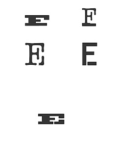
The element: iron. The Periodic Table of Elements symbol: Fe. The reason for the "f" and "e": the abbreviation is  derived from the latin word for iron, ferrum. The idea behind the monogram: strong, sturdy, and the main idea that steel, which is made from iron, is one of the sturdiest and practical metal allows there is.

This set of iterations was based on iron and its natural state of existence. It's really never found alone in nature. It's almost always connected to some other element, in many cases oxygen through the process of oxidation (or rusting, in simpler terms). 

 This set was based on the allows of iron. Two substances come together to make a better stronger one. Carbon and iron are combined to make steel which is much stronger than either by themselves. These iterations were a little off though. The ones with the lowercase "e's" on top look a little floaty and don't have the sturdiness I wanted.
 These iterations are also based on the two elements combined to make a better one.  One difference from the above set though is that they work way better. The continuation of the leg of the "E" off of the serif of the "F" makes a good, sturdy, structured appearance, that was also combined by two things to make something better.

More iterations based on a few of the above.


This idea was eventually decided as the chosen direction. Refinement was needed though and a different font was eventually chosen.
THE FINAL MONOGRAM! After discussing the above iterations with Marty, I decided to change the typeface to Serifa. This is the result and that is what I'm talkin about. The one on the left had a space between the serif of the F and the leg of the E that was the same as the width of the serif on the lower arm of the F. The one on the right has had this changed. The openness of the one on the left was a little too big and slightly distracting. The image on the right is the final monogram.

Wednesday, October 20, 2010

Self Critique for Line Study Posters


1)Both the image (a bench) and line study have this organic flowing curve (see the first iteration for the best example).  The study was also broken up and seemed to appear as a grid that was in a wave.  This gridded study matched the weaving that occurs in the bench.  I then went on to weave the line study in and out of the bench to complement the pattern already in the bench.

2)The photo loses its context in the bottom two studies.  The second iteration could come off as an upward look toward some skylines while the third iteration loses the bench through the spiral made. I plan on trying to add other visual elements to the composition to create a contextualization and properly inform the viewer that it is a bench.

3)All need to be vectorized and smoothed out.  They are very rigid and rough.

4)The typeface chosen has smooth curves and an organic feel which reflects the curves well. The text is also weaved into the composition like the line study to compliment the bench.  In the second study the text placement is a little distracting and doesn't really reflect the study well.

5)The first composition sits in a corner to create a relaxed feel, and the line study integrates with the picture through the use of alignment and continuation.  The framing of the second study is what gives the  skyline feel and scale is used in the final study to create a large distance between the foreground and the background.

6)The bench and smooth flowing curve both give a relaxed feel which is a major concept in the 
West Port scene.


Only two here because the third image won't upload.

1)The gridded structure of the West Port roads was complimented by this angular and simple line study.  In some places of the study a gridded and consistent horizontal and vertical composition is interrupted by some lines extending away from the grid.  It was these squares and lines coming off the standard grid the reminded me of this map and West Port in general.  West Port is askew with the rest of Kansas City and sits at an angle to the rest of the KC road system. Some better alignments could be established to make a better reference and a clean up in craft will help as well.

2)The photo is a little blurred, pixelated, and the contrast isn't great.  The map that I took the picture of doesn't help either because it is pixelated and really bad too.  However, since I'm looking for just the grid of the area and the shapes that are made I was able to put a filter on the picture to smooth out the edges. I still want to play with the contrast though and see what can be done.

3)Some craft should be addressed to better establish the relations between the streets and the lines.

4)The typeface was chosen to express the simple and square grid that is present.  However, I think that all capitals will help reinforce this idea better.

5)alignment and continuation are used to establish the connections between the roads and the lines both in positioning and in size.

6)Since West Port is at an angle to KC, this concept used in the poster design really reflects it well.  The angles are complimented through the dark bold blacks.  If the angles and cockeyed West Port was unnoticed then the black forms should point it out.


1)The strength in these ideas comes from the rows of bricks and their correlation to the random rows of white in the line study.  This particular brick formation is broken up which is complimented by the randomness in the line study.  I believe the final study works the best.  The line study can sit behind the bricks and through this has a better attachment to the bricks.  The first two feel slapped together and sloppy.  The line study just sits on top of the bricks and doesn't really integrate. In the final study it seems like this line study is hiding behind the bricks and the bricks are being removed to reveal the study behind.

2)The photograph is easily read as bricks and the different size of these brick fragments correlate to the different sizes of white rectangles in the line study

3)The quality and craft is pretty good in these and should really just be refined to create better alignments and correlations.

4)This typeface is heavy, solid, sturdy, and the slab serif directly compares to the bricks.  I want to find better ways to integrate the type however. The type also, like the first two studies in general, feels tacked on and just thrown on top.

5)In the final study the framing that occurs within the bricks is what I find really appealing and an attempt at an alignment was made to line the bricks with the line studies in all compositions.  This alignment idea will need to be refined and worked with

6)The bricks give an antique feel to West Port.  The bricks remind me of a time when travelers were heading out West in wagon trains.  Old cobbled stone roads and horses.  Prospecting for a better future and what have you.  Nostalgic to the max.  And the type helps establish this feel too.  I think I've seen it used on a salon in a western movie or something similar.


Blog Mod

here's the little somethin I put together for my blog.  Orange and Brown color palette to go with the season and upcoming Halloween holiday, plus I just like orange and brown.  The background I based on perpetual motion and energy.  Essentially, all things come around and all forces are self driven.

Wednesday, October 13, 2010

Juxtapositions that Are Not Planned

One thing I can safely say I effectively learned from Hugh Merrill is the ability to stop and look at coincidences between imagery.  Laura Fields talks about how she began to notice the juxtapositions at one point.  They weren't always obvious at first.  I learned this in Hugh's class.  The eye must be trained to notice some of these coincidental juxtapositions.  Since being in Hugh's class, and being at art school, my eye has slowly developed the ability to notice correlations between imagery.  The ability to do this becomes a subconscious thing.  Something that one had to think about and search for at one time can become something natural and obvious.  Learning to make and see these connections, I have learned, is a way to improve one's visual language.  Making these connections can help motivate one into the next project.  It's a good way to step back from what is visually obvious and see a greater, even if unintentional, meaning.

Friday, October 8, 2010

Bitmap Display


My item was a bent and modified paper clip.  It was a very light weight and delicate item to position but the negative space created between paper clips is a nice enough outcome to counter to numerous repositioning.    The thinness of each unit reinforces the light weight of the actual object  and the overall image takes on a gray appearance.

Wednesday, October 6, 2010

My Type Element

The element I have been given for Typography is Iron/Fe. Atomic number 26

Reading About the Lines

Dealing with these lines and planes has been an interesting experience.  In high school I was really into geometry and mathematics (and still am somewhat) so when reading this segment on lines and planes I found something I could really relate to and tie to a non-art world (even though math exists in everything, even art).  Since I have strong abilities and interests in science and math, I like to find relations between these two fields of study and the field of art, primarily visual and fine art.  Dimensionality is another aspect I really took to with these line studies and the reading.  There are an infinite number of dimension possibilities in reality, all of which provide a new aesthetic and point of view on a situation, image, or environment.  Understanding all dimensions and all points of view of something can really open an all new perspective on one's understanding.  Dimensions, to simply put it, just create some amazing movement.  Dimensionality really allows a viewer to look at something and believe that there is a distance or closeness between the viewer and object.  It pulls the viewer in and immerses him in the visual field that has been created.  The viewer can feel like they are a part of the environment created.

Monday, October 4, 2010

Line and Share


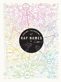
Here I have posted three different examples of design using lines.  The chart of rapper names is strictly informational, the book page is imagery overlapping text to emphasize segments and meanings in the text, and the image of the spider with some other lines doesn't have a known meaning.  The poster and book page both cam from ffffound.com.  The other picture comes from a far different source and might be considered a little unorthodox.

The poster is pretty much a flow chart of rapper names.  It reminds me of the mind maps we did in viscom.  There are six sections that the names are divided into and these are shown with their own color of lines on the poster.  These lines then criss cross and span the page to establish connections in rapper names between each of the categories.  These lines create a really smooth gradation in the poster and make it more than just informational.  Yet the poster doesn't ever lose its readability.  I was able to properly find every member of the Wu Tang Clan (except Inpectah Deck) based on their names and the  categories presented.  It took a little searching but I was able to find eight of them without any real hassle.

I find the book page really interesting because it reminds me a lot of transparencies we used in our books for viscom and type.  I don't know if the page shown is actually a transparency of images on top of a page of text or if maybe someone doodled in a book, or even if the book was printed this way.  Any which way it is the page is very clever in my opinion by leaving the open "windows" for the text to show through.

The final image is easily the oldest.  I still feel like it's a really good example of lines, design , and craft though even if it might not be a typical concept of graphic design.  There are many of these compositions in the Nazca valleys in Peru.  They were crafted by Native Americans as long ago as the 1920s.  This was just when they were discovered though due to airplane travel.  These structures are enormous and some span several miles.  They couldn't have been seen from anywhere other than above so it's possible that they've existed longer.  The purpose for these aren't known but I suspect they were used to communicate with the gods of whatever people crafted them.  There size is what makes them so impressive.  They literally span miles and when seen from above these lines seem perfectly straight.  How could these people have hand crafted these massive mounds for miles AND keep them straight?  Religious devotion.