Thursday, February 24, 2011

Type Campaign TV Storyboard

First two storyboard sketches. The first sketch uses the quote "Design is a formal response to a strategic question." The type as image was used to frame the quote in a way. The second sketch uses the quote "Design should never say, 'Look at me.' It should always say, 'Look at this.'" In this storyboard the type as image is used to reveal the type. It visually looks like the volume levels on a boom box. The chosen direction was the second sketch which was resolved a little in some places and resulted in the below storyboard. 

Final Buses and Boards


The final sets of the buses and billboards for the Graphic Design is... campaign. Tag line dropped, more space given to the quotes, and the author of the quotes moved closer to the quote. Also the type as image composition in the Design/visible billboard/bus was changed to something that showed a moment of clarity in a way. It makes the intelligence in the composition visible with its anomaly. Also an energy of sorts was placed around the entry to the buses using the type as image.

Tuesday, February 22, 2011

Base Drawings to Icons

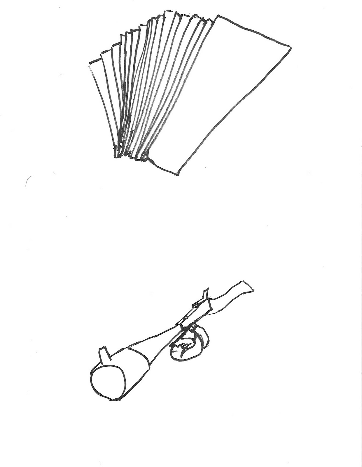
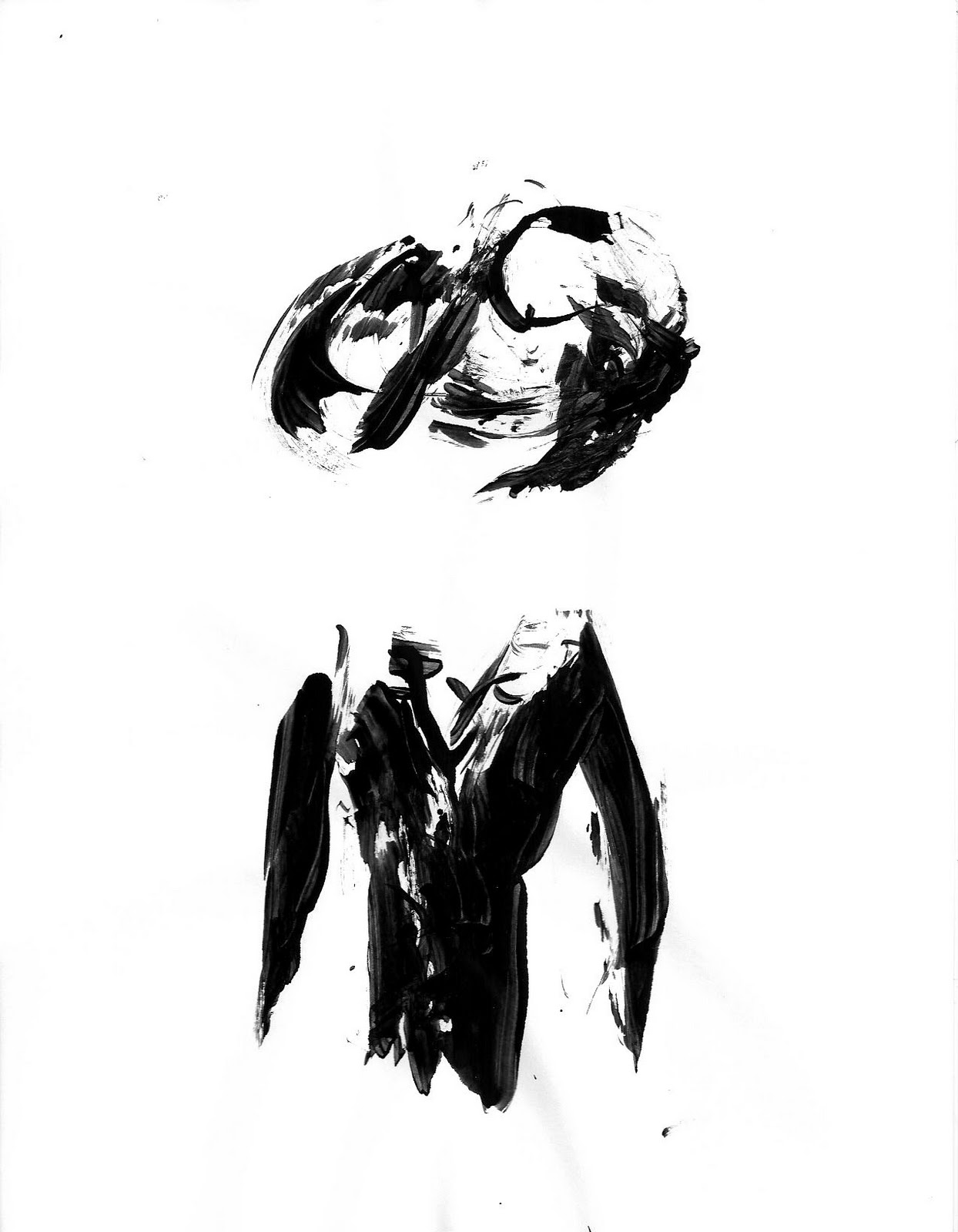
When I turned in my first thirty base drawings, only two of the thirty were working. So I redid them all, but not without sketching and looking at others base drawings first. The above picture is two sheets of sketches I did. One is with a chisel tip sharpie and the other was done with charcoal. These were just practice sketches to help get the feel of what the assignment was. After I felt comfortable with what was supposed to be done, I moved onto the thirty base sketches.

 Charcoal

Pencil on grid paper

Sharpie

Final four sets of base drawigs

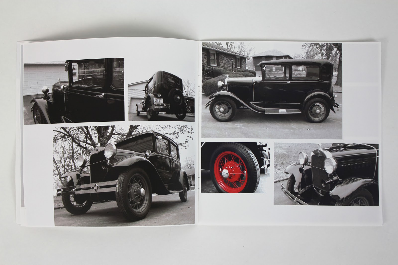
The base drawings chosen were: the charcoal, all views of one of the corner; a few pencil on grid, some fragmented and geometric and some symmetrical; and a few brush and ink ones with organic curves. These base drawings were used to make my first twenty icons. 

The top row of icons were based on the fill and line quality styles.
the second row were based on the framed and fragmented styles.
The third row were all based on the organic style.
The last row was based on high contrast and 3D and geometric styles.

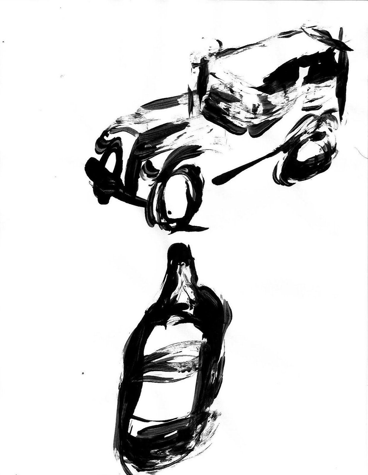
The chosen directions to pursue with a set of icons were the high contrast 3D (as seen in bottle in bottom left corner) and the fragmented geometric style of the car (second row, right).

The high contrast suits the culture. The style resembles what a gangster thrown under a spotlight at the police station getting grilled with questions might look like. The geometric and fragmented shapes resemble what a modern icon would look like. The 3D high contrast style doesn't resemble modern icons too well, but these gangsters are also not modern so the high contrast style is the way to go.

These two sets of six icons are some examples of what was crafted for each direction. The final choice of direction is the 3D high contrast. A lot of work is needed in refining these though. The angle and lighting are going to be essential in perfecting these. 

Sunday, February 20, 2011

Final Nikola Tesla Poster


Final artifact turned in for The Constructed Image project. The food was treated far more delicately in this version compared to the last. The size of each cube and the placement was executed with a more careful precision. The cubes were made to be near equal in size and they were placed to line up on the grid used in the composition. This alignment, paired with the grid, and placed in proximity to a few numbers and equations in the Physics book all reflect Tesla's highly calculated mind. He would calculate the amount of food he would eat before every meal. His claim to fame, the Tesla coil, is featured in the composition and is attached to the physics book with some wires. Another cable comes from the book and runs off frame. These cables are attached to the physics book to emphasize the quote used. Physics is the wheel work of nature and drives and governs all things that exist. The wiring attached symbolizes the dream in Tesla's quote that someday man will be able to harvest the raw kinetic energy that exists and powers everything. Finally the electric style of lettering carried out with his name and the physics book both represent the fields of work Tesla was involved in. He was a physicist and more specifically a scientist devoted to the workings of electricity. 

First Bus Wraps for Type Campaign


All  billboard information directly applied to bus wraps for our typographic campaign. Same goal as billboards. Provide visual interest and a quick and clear read of the design quote. Considered the quote being read on either side, but never tried the quote on both sides. Since the tagline has been decided to be dropped this will be a direction of choice for the next iterations. The quote will be featured on both sides of all buses and the composition will probably retain a greater visual interest on the side of the bus people enter. I do not want to overly distract on the side of the bus that would face the road and not the sidewalk (a good point brought up in class critiques). I have also taken into consideration how people enter the bus and aspects of the bus that would compliment the type as image compositions. The main aspects of the bus that were complimented were the door that the passengers enter and the wheels on either side. The wheels have a movement that I tried to carry over into some compositions and the door has an interaction with the people that I wanted to take an advantage of.

Friday, February 18, 2011

Pictogram/Icon Editorial

The pictogram communicates. But doesn't all art communicate. Connotations and denotations are experienced when we look at anything. When a person made what we look at though, we as people always tend to, or at least try to, see what they are conveying in the piece. Expressional, conceptual, theoretical, realistic. All convey a message. However, pictograms don't just communicate an idea, they communicate the idea in its simplest, but still readable form. The pictogram captures the essence of what it signifies. And we people read the essence. We don't look at the pictogram for exactly what it is. We see the forms, which is what a pictogram comes from. There are no conceptual relationships between a pictogram and an object. No concept to the essence of an object, unless made that way. In some cases, a style choice may allow for a conceptual tie to the object, but its essence will remain the same across any style and will not inform any beyond the interpretation of the image. It is seen for what it is. However, when placed in a context the meaning can change or a concept may be drawn. Language is a little like this too. We have words that represent things (even though, as far as I know, in most cases the words don't conceptually relate to the object. When we hear or see words, we receive some kind idea. If the word is by itself then all we understand is the reality behind the word. We only see the the object or thing represented by the word. However, when words are place in certain areas or are used in writing the meaning can change or an extra layer of meaning can be added.

I appreciate the comparison to typefaces that Lupton makes in Design Writing Research. She even gives some examples of a man pictogram with serifs, in italic and in cursive. Really I hadn't thought about type in this way. The sans serif fonts capture the essence of all letters, while serif typefaces fail to do so. Historically, serif type is the original lettering used in the western world. Then the sans-serif type came about to simplify letters and allow for quicker reads that don't allow the details and serifs to get in the way of a quick read. This is the objective behind the pictograms. A quick read. We read pictograms fast and without confusion. They are stripped to the bare essentials needed to convey their idea. No extra detail is present or needed. The essence is conveyed, read, and therefore successful (as long as its read quickly and clearly).

Thursday, February 17, 2011

Billboards Revised and Re-revised

The first issue I had with my first iterations was the lack of color. I liked the black, white and gray at first. I felt like the simple black and white allowed the intellect and wit behind form in design to stand out. However, after seeing all the other billboard iterations I really wanted to see some color. The second issue I had with round one billboards was the lack of interaction between the type and the type as image. So both issues addressed this is round two. 


After a little critique with some classmates, it was decided that the second round of billboards was too crowded. They were all pretty crowded, loud, and it was hard to tell what was important. So they were all simplified, mostly everything made a little smaller. I've had a little trouble with choosing a color palette. I wanted to do a set of billboards that were all colored, but I kept wanting to drift toward a white billboard with an accent. So I looked for a some tips on choosing a color palette, and although most were about interior design I was able to get a little help from the web. I feel that the color in the third set is far better than the first.

The concept behind my set of quotes and my campaign is the visual and formal intelligence employed in design. Its strongly about the intelligence and knowledge needed to design well.


Sunday, February 13, 2011

First Icons

Small tip sharpie
fedora and zoot suit

Model A and alcohol

money and tommy Gun

siren and handcuffs
blood and alcohol
 Fat tip Sharpie


fedora and zoot suit


Model A and alcohol

money and tommy gun
siren and handcuffs


blood and blood

Dollar Bill and Ink
fedora and zoot suit

Model A and alcohol

money and money

tommy gun and siren

handcuffs and blood

blood and fedora


I used a thin tip Sharpie, a fat tip Sharpie, and a dollar bill with ink on it for my three mark making devices. The fat tip and the dollar bill both began to produce more interesting results while the thin Sharpie results really just looked like sketches. I drew these all up systematically. I went through the set of nine and then redid the one I like least, a little differently though. This gave me ten icons with each tool. The dollar was chosen so some conceptual context was maintained between the material and the subject matter. The dollar bill was the only one of my artifacts I could use to make effective and controlled marks with so I tried it out. The results were a little hit and miss. Some icons work and some are a little vague looking.

Design Quote Billboards First Glimpse


With each set of billboards I did, I tried to pick a set of three compositions from my kit of parts that were cohesive. I looked at serif versus sans-serif and the amount of dark space and the general weight of the letters when I chose a set of three. I also considered letterform and composition in the last two sets respectively. In pairing a composition to a quote I considered the aspects of design the quote addressed. There is certainly some crossover in composition and quote pairings but I was still pushing for a relation between the two. The hierarchy used in the quotes is arbitrary for the moment they don't have anything to do with the singular composition or set of billboard compositions. Finally, I have three tag lines in effect here. Graphic Design is: visually clever, visual wit, and witty visuals. I'm partially fond of witty visuals. The other are more proper, but maybe to be heard better a less proper tone is needed. Better appeal to the masses and the average person

Friday, February 11, 2011

TESLA Poster: First print

In my poster I really want to create a sense of surrealism. My goal in doing this is to create a sense of the world that Tesla lived in. He clearly saw things and understood things other people couldn't. I wanted to partially represent his way of thinking by creating the world that his mind lived in. The symbols employed in the piece are the physics book and chopped up food and the gridded floor. Physics was a field he worked in. More precisely he worked in the field of electronics and magnetism. The specific spread of the text book is open to a page that deals with the unit Tesla. This unit measures magnetic flux density. The indexes employed are his Tesla Coil and the electricity emanating from it. I must draw a difference here between the field of electronics and physics because they both seem similar and might seem that they should both operate as one or the other, not one for each. However, Tesla worked with physics but I would never correlate the two. Physics does not point to Tesla. However, due to Tesla's extensive work with electronics, I almost always relate the two to each other. Tesla largely defined modern electricity and the way it's used.

Crooks: Artifact Book


The 1920's gave birth to organized crime in America. The Prohibition created a demand for alcohol. Some people saw this as an opportunity to make money. The smuggling and distribution of alcohol is how organized crime came to be. The time period was also frequented by bank robberies. Capone and the bank robbers had one thing on their minds: money. Once they had their coveted wealth they began to wield some power and influence in many communities. And with the power and wealth came the notoriety. They were all infamous for what they did, even admired by some.