Sunday, April 24, 2011

Final William Faulkner Ebooks/ Presentation


As far as presentations go, this was embarrassing for me. I feel like the display of my context shots could have been better and the shots themselves could have been far better. Although, I always look at doing badly with things as a chance to understand how to do them better. So, from here I can only do better, and will.

Wednesday, April 20, 2011

Zines for the Pad

Several things caught my attention in these videos showing magazines on the Ipad. First of all, this whole concept is far cooler than I had expected. Some really new and innovative things came out of this and that is exactly what I didn't expect. The idea of getting a full 360 degree view of products in magazines was an awesome idea and the magazine directory is also awesome. The magazine directory allows quick navigation throughout a magazine without thumbing through pages and searching the table of contents. The coolest part I saw in innovations was the visual footnotes. This allowed the footnote in text to be clicked on and shown. No searching at the bottom of a page for a lame resource. Now you can click and be shown the resource.

These looks at magazines on the Ipad really changed my mind with the Ipad and its everyday innovative aspects. Up til now I think I've only seen ordinary computer things done on an Ipad, but only touched instead of clicked.

Sunday, April 17, 2011

Gangster Magazine Layouts

These first three spreads are explorations for a typographic and layout style of my magazine spreads. These are just the cover spread for the article. The article that I chose for the spreads is a combination of two articles. The first is a look at the Depression Era outlaws in general and the the second focuses on the Mafia in the U.S. The first spread was the chosen direction in terms of typographic hierarchy with the subheads and the page number placement. 

I chose to use fairly narrow columns and a number of columns on each page to emphasize the idea of newspaper spreads and layouts. The outlaw culture of the Depression Era was extremely notorious and many of the outlaws frequented newspaper headlines throughout the country. 


In this set of iterations I really wanted to get the gridded layout down to allow a nice amount of space around all the elements of the page. I do not want my spreads to be as dense as newspaper layouts. The first spread introduces the gangsters of the era and gives some information on the origins of the outlaws. The accompanying infograph shows the areas of influence of a few of the most notorious gangsters of the time. The second spread is a focus on the American Mafia. It gives general info on the Mafia and the Mafia during the Prohibition/Depression. The infograph is a timeline of Al Capone's life. The final spread is about bank robberies of the era and the capture of the most infamous of all bank robbers, John Dillinger. The infograph is a chart of monetary values that were tagged on Dillinger during his reign as Public Enemy #1. 

I will keep these layouts essentially the same continuing into the next phase. Some elements will be introduced to continue making the spreads more visually interesting and ideal for the culture.


Friday, April 15, 2011

DVD Packaging Find and Share


The first two are examples of dvd covers (front and back), the next two are posters and dvd covers (they both use the same elements), and the final is a poster for the film. I chose these examples because there is a juxtaposition in the imagery that express relaying and anchoring messages. Addicted to Plastic is the only true anchor in the set, but I also think that the sweeping money could act as an anchor too. They rest are certainly all relays 

Tuesday, April 12, 2011

Two Symbols in One (reading response)

This reading brought up the idea of juxtaposition which I really like. When working on my designer poster for Typography II, I came across a lot of juxtaposition in his work. When juxtaposing things the message can often be changed or a greater understanding of the idea can be seen. This is what we are trying to accomplish in relaying and anchoring our icons with text and image.

Grids as a Frame (reading response)

Without doubt I found Jacques Derrida's assessment of the frame the most interesting thing in this reading. I even love the ideas of geometric, rational grids and the golden rectangle. I appreciate these concepts because of their rigid mathematical basis. The philosophy of the frame blows this stuff out of the water though. 

Lupton calls the page a frame and then follows this up with an explanation of Derrida's philosophy on the frame. In short, Derrida says that the frame calls attention to an artistic piece and sets it apart from the everyday world. He says it acts as in a formal way but is not seen as a form. It sits aside and in the back in a way but it could not be considered a background. Grids do this whenever a designer breaks a grid with certain elements. When a composition sits in a tight grid, the elements that break the grid have a greater attention drawn to them based on the way the element is positioned or "framed" on the page. Whatever the work is featured on is a frame too. It has a presence and it calls out the content that it features, but it is overlooked when the artwork or content is at the center of attention.

Final Peter Saville Poster and Postcard


Final poster and postcard turned in for critique. I had three goals to accomplish in the making of the poster influenced by Peter Saville's design philosophy and work. 

The first was to use a juxtaposition in type and in image. The type is a combination of Univers and Trajan––one modern sans-serif and the other an old serif typeface. The imagery is a combination of the organic chandelier in Vanderslice Hall and a rigid pattern. 

The second goal was to represent Vanderslice Hall in a way that didn't make any obvious reference. I set out to do this with the photograph of the chandelier and other key features of Vanderslice. The chandelier, however, was the chosen direction because it had the feel of Vanderslice with the classic organic structure, but it wasn't too clear. 

The third goal was to limit the poster to only what was necessary. This was hard to do typographically. At first. I finally decided to use the type to underline the main aspects of the lecture (the title, the artist, and the time). Since the poster was meant for the student audience here at the Kansas City Art Institute the location is implied. 

The exact same ideas were applied to the postcard. The yellow letters become hard to read on the white however. This could be good or bad, considering I wanted the secondary information to be subtle. Might be too subtle though.

Monday, April 11, 2011

Icon/Culture Exhibition Titles

I currently have four ideas I'm working with for exhibition concepts.

The first is the idea of money as the foundation for life. My culture of outlaws came about during the Great Depression when jobs were scarce and money was short for everyone. Many people took up lives of crime to avoid the difficulty and impossibility of finding a job. This exhibition would be named "yEARN".

The second idea concerns the power of these criminals, especially the Mafia. The title here would be "Powered by Criminals" or "Criminal Power".

The third idea is based on the clean, dapper, and organized side of the Mafia. This is the unexpected side of the Mafia, and one people look over due to the dirty violence. The title here is "Criminal Filth" or "Organized Filth".

My last idea is based entirely on the act of the prohibition. It would deal with the split in the population over whether or not alcohol should be prohibited and if it really had been considering alcohol's accessability during the prohibition. The laws were enacted to clean up America, but made it dirtier in the process. Title here is "Prohibited?"

Friday, April 8, 2011

First Digital to Final Ebook Covers

This is a post of my original digital cover designs, my final cover designs, and my cover designs in context on an ebook purchasing site. The next task is to take the screen shots of the cover in the ebook store and put them on an iPad. Once on the iPad we take photos to document the context of the project and we will present these documentation shots.

First Digital

I have two sets of ideas for my first digital iterations. The first uses a circular motif from the story that doesn't reference the title. On top of this circle is an object of destruction from the story


 This set was based on using imagery that is mentioned in the title as a circle motif with an object of destruction on top


 Final covers


Screen shots of ebook store


Crime Pays: INFORMATION GRAPHIC FINAL


In my timeline of Al Capone I use the icons to signify key moments in his life. I break it down into movement (car), violence (gun), notoriety (hat), and imprisonment. In the map I use the icons to refer to different outlaws. The icon and outlaw relationship is a little arbitrary but is also significant in some cases, like Capone was largely known for his involvement with bootlegging alcohol. Lucky Luciano is known for establishing the American Mafia, which I think the tommy gun could symbolize all on its own. The car refers to Bonnie and Clyde because they were on the run the entire time their crime streak was in effect. Finally the cash is used to symbolize Dillinger because he made a living robbing banks. The cash is then used again to express quantity in the Dillinger graph. The graph is totally about monetary values so the icon is entirely appropriate in its use. 

Although I had a hard time translating my cultures information into information graphics, I still learned about how to make them and how to think about quantitative data in a visual way. I will continue to research and observe information graphics. I really want to be able to someday achieve some very complex information graphics that have multiple levels of information and readability.

Thursday, April 7, 2011

Style options


The map is just a screenshot showing what I was thinking for a frame on the text boxes. This way I can noticeably attach the icon to the text. As an afterthought on the map infograph, I considered removing the textboxes from the map and placing them off to the side. That way I would relate the icon to the person in the text box at the side and not have to have a key. It would also help clean up the map. 

I'm leaning toward the the timeline with the lines but was concerned whether or not it went well with rendering of the text boxes in the map (or if the difference in style mattered at all). 

Sunday, April 3, 2011

From Research, to Sketches, to Infographs

Dollar Bill Layout

Labels for the various insignia, codes, and other such legal obligations that are printed on American Currency. 

http://www.ischool.utexas.edu/~jpwms/mixednumbers/money.html


One of two John Dillinger graphs. This one charts some interesting numerical values he encountered in his bank robbing days. It mostly shows some fun facts for the bank robber like how many times he was shot at his ambush, how many police officers and FBI agents there were to arrest him at the ambush, how many people he killed during his escapade, etc. 

http://www.billlucey.com/2009/06/john-dillinger-fast-facts.html

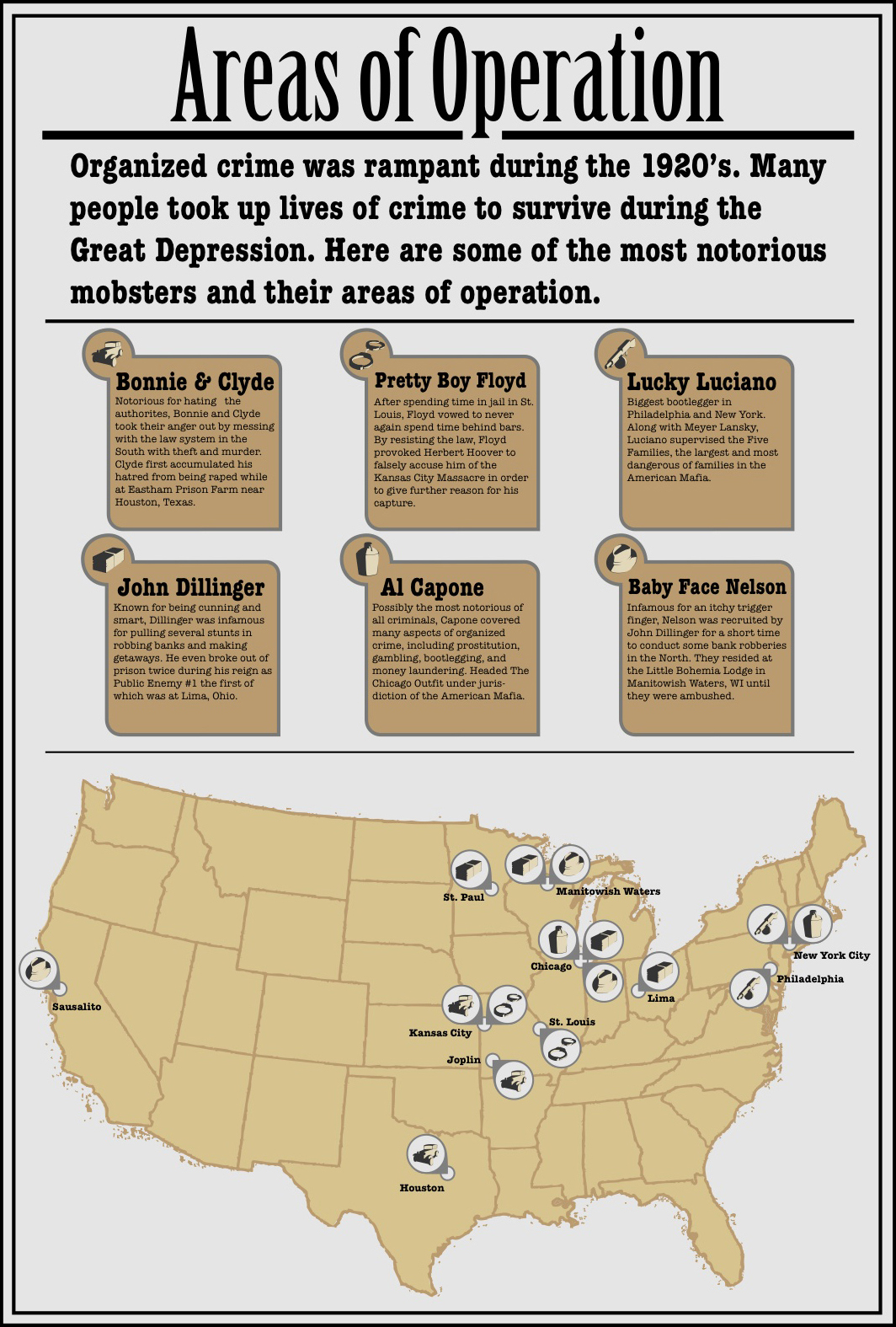
This is a map showing the various urban locations of the Mafia in the United States. 

http://www.americanmafia.com/26_Family_Cities.html

Another John Dillinger graph. This one shows some particular cash values that were attributed to him at different times in his life like the reward for his capture/info on his whereabouts, his total accumulation of money from bank robberies, and the amount of money in his pocket at his death.

http://www.billlucey.com/2009/06/john-dillinger-fast-facts.html

 A timeline of Al Capone's life. It charts his life from the moving of his parents to the U.S. to his death. 

http://timelines.com/topics/al-capone

Timeline of the Prohibition on alcohol in the U.S.

http://americanhistory.about.com/od/prohibitionera/a/prohibition.htm

Timeline of Bonnie and Clyde's killing spree.

My Life with Bonnie & Clyde by Blanche Barrow

A map of where Bonnie and Clyde had killed a person or people in there attempts to stay away from the authorities.

http://en.wikipedia.org/wiki/Bonnie_and_Clyde#The_spree

A graph showing the rise in crime rates & federal prison expenditure and occupation.

http://www.albany.edu/~wm731882/organized_crime1_final.html


These infograph sketches were then transformed into the following six. These six graphs were a push in finalizing the content of the graphs. We also decided at this point which infographics were worth keeping and which weren't. These all also begin to explore the type that will be used for the infographics.


A differentiation between the civilian and police officer killings was made and implemented in this iteration.

The graph was broken into two graphs to showcase one for crime rates and the other for penal institution expenditure and inmate population.

The two John Dillinger graphs were combined to draw a connection between the two. The random numbers happened because of his time robbing banks and the cash values exist because of the same reason. 

Some more minor cities dropped from the map to clear up space.

The level of drank in each jug references the amount of illegally distilled liquor that was being purchased throughout the course of the Prohibition/Temperance movement. There is no actual quantitative value attributed to the amount, but the increase is only there to imply the increase.


These six then became the following six. These six begin to explore style choices, and at this time had been narrowed down to four infographics. Stylistically, I wanted to reference the 3D elements and the spotlight-like harsh contrast of my icons.