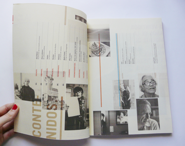
Tuesday, September 27, 2011

Packaging Find + Share

Pathos
Nestle/Wonka
Everlasting Gobstopper
Appeals to the chillun

The colors and the playful nature are what first draws me in. The colors also keep me looking at the package. The bright circles wrap around the box to the sides and the back and the little story on the back about the adventure waiting inside the  box keeps my interest as well, up until the box is empty and its time to get more candy somewhere


Ethos
General Electric
26 watt fluorescent bulb
Appeals to all esp. adults and energy & money savers

The bold $59 tag and the red colors draw me in initially. I continue looking to find out more about the quality of the bulb like its light output and bulb life. The life of the bulb alone is enough to keep me looking at the product in awe. And I'm saving 59 dollars.

Logos
Bolthouse Farms 
Green Goodness
Appeals to health nuts

The shape of the bottle and the overall uniform color palette (from the color of the cap to the color of the contents to the picture of the ingredients) draw me in instantly. These bottles have always stood out to me. The analogous greens do a great deal of drawing me in. I keep looking and get more interested in the product when I look around the bottle and I find a list of every ingredient used in the drink and the amount of each ingredient. It also offers a visual of how many fruits are used in the drink in addition to the typed out list. This bottle is very informative and fascinating to look at and see what was used in the making of.


ROUND TWO
(just for practice and becoming familiar with the modes of appeal)
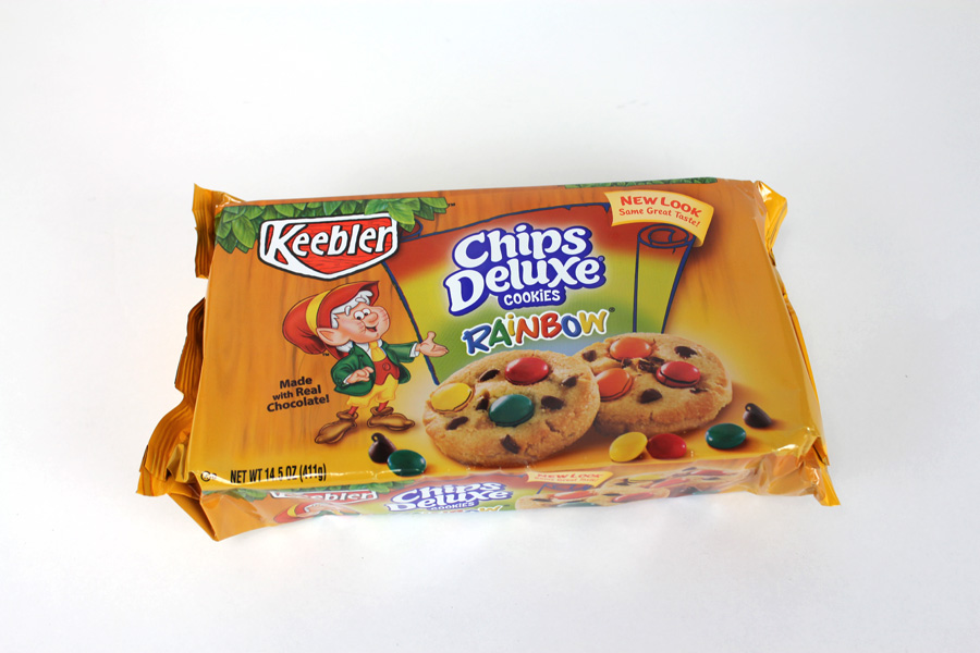

Pathos
Keebler
Chips Deluxe: Rainbow
Appeals to the chillun and sweet tooths

The bright colors draw me in and the little Keebler elf, because I like sugar and I know Keebler makes some awesome sweets. The description of the quality of the cookies keeps me looking a little bit longer when I flip the package and look at the back.


Ethos
Jif
Creamy Peanut Butter
Appeals to choosy moms (and little kids)

I particularly get drawn in with the colors and especially the logo type. I like how the "j" and "f" are essentially the same shape just rotated. The logotype is the only thing that keeps me interested


Logos
Burt's Bees
Natural Skin Care for Men Deodorant
Appeals to smelly dudes who are avoiding the aluminum in other deodorant (that's what drew me in)

Yeah, knowing its deodorant without aluminum is a big appeal to me. The thought of it being created out of bee material is interesting too. I keep looking because of the ingredients used and the pattern on the front is nice to look at. Really the  content and make up of the deodorant do all the work for me here.

Tender Buttons Process

Originally for my Tender Buttons anthology, I wanted to create a box that each of my poems could individually fit into. This was meant to emphasize the form of each individual poem. Each poem was meant to act as its own entity and I felt like a box that had some shelves that could house a tablet with a poem per tablet would be an acceptable solution. I was wrong. It didn't take long to realize that the box with shelves was just going to be too big and draw too much attention to itself and distract from the typography on each tablet. So I dropped the box with shelves and resorted to a recipe-box-like idea that  would still keep each poem contained but separate. Still too much though and I dropped the box idea all together. Here's my process of failed boxes. It's all good though, because the wire-o binding I settled on in the end was the necessary solution.


first time I considered using both sides of the tablet


Monday, September 26, 2011

Final Billboard and Poster


Folly Poster Revised and Billboard


After some more feedback and considerations I revised my poster. This is the final result of this project. I chose to incorporate the swirling background again to keep the background from becoming too static and to provide a greater depth in the poster. A few tweaks were made concerning the typography and then the posters final elements were transferred to a hypothetical billboard. The end...

Sunday, September 25, 2011

Nnenna Freelon Poster Process (Final sketches to first digital)


These are my initial poster sketches for my Folly jazz poster. These sketches begin to explore the layout of the poster, the rendering of the poster, the typefaces used, and the way the information (date and time) is conveyed. The three concepts I used in sketching these were the idea of Freelon's voice flowing like water, her voice and music expressing love, and her show-woman-ship.


These iterations were the first digital compositions for the poster. Still rockin' the same concepts minus her vocals expressed using hearts reflecting the love in her music.


Dropped the idea of trying to visually express her vocals using a specific motif and moved forward with the idea of her stage presence. Instead of using a motif to express her vocals I have decided to allude to her vocals and music through color palette and composition in the poster.


Two further iterations of Nnenna's stage presence. The background I use came from my rendering tests exercise. It is construction paper slapped onto a white illustration board disc and spun on a record player to get the smooth blurred colors. 

Grid Inspiration From Dale Magazine


I came across some pretty bitchin' uses of the grid in some magazine layouts. Considering the scope and focus of the upcoming project I felt the need to share these. These layouts belong to two different magazines. One appears to be an architecture magazine of sorts and the other is some artist magazine. It has articles on the Beatles and Andy Warhol so my assumption is that it is just a mixture of pop culture of the time. Both are in different languages so I don't know much about either, other than these layouts are cool! Check 'em out. And there's a link to Dale so you can see more of the spreads.