Showing posts with label type3. Show all posts

Tuesday, September 27, 2011

Tender Buttons Process

Originally for my Tender Buttons anthology, I wanted to create a box that each of my poems could individually fit into. This was meant to emphasize the form of each individual poem. Each poem was meant to act as its own entity and I felt like a box that had some shelves that could house a tablet with a poem per tablet would be an acceptable solution. I was wrong. It didn't take long to realize that the box with shelves was just going to be too big and draw too much attention to itself and distract from the typography on each tablet. So I dropped the box with shelves and resorted to a recipe-box-like idea that  would still keep each poem contained but separate. Still too much though and I dropped the box idea all together. Here's my process of failed boxes. It's all good though, because the wire-o binding I settled on in the end was the necessary solution.


first time I considered using both sides of the tablet


Sunday, September 25, 2011

Grid Inspiration From Dale Magazine


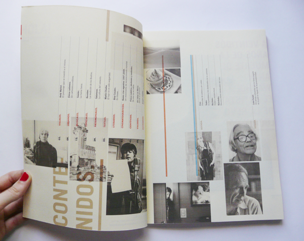
I came across some pretty bitchin' uses of the grid in some magazine layouts. Considering the scope and focus of the upcoming project I felt the need to share these. These layouts belong to two different magazines. One appears to be an architecture magazine of sorts and the other is some artist magazine. It has articles on the Beatles and Andy Warhol so my assumption is that it is just a mixture of pop culture of the time. Both are in different languages so I don't know much about either, other than these layouts are cool! Check 'em out. And there's a link to Dale so you can see more of the spreads.


Monday, September 5, 2011

Type 3 in class exercise


These were two exercises I did for my Typography 3 class. This was an in-class assignment in which each student was being limited in their design choices in laying out the lines of a certain poem. We were given coins and were instructed to flip them. A heads or tails denoted what weight of font we used, the size and leading and the placement of the type on the page. Part of the point of the assignment was to embrace serendipitous moments in design and to understand what is readable as type overlaps and such. Just a short exercise, but plenty to consider as a designer. 

Concept and First Layouts of Gertrude Anthology

Like in my video, I wish to express the cubist influences of Gertrude Stein. More important for the anthology, I wish to express the intended neutrality of Stein's poetry. It is abstract poetry and she writes it to avoid any preconceived concepts to be interjected into the reading of the words. This neutrality will show in my anthology by framing each passage of poetry on a square surface. The square is a shape that has always denoted neutrality and regularity while a rectangular page would typically denote a narrative of sorts. Furthermore, the type will be arranged on the page in a way that does not depict the top of the page. The "page" can be held and read anyway it's orientated. The type itself will more than likely conform to a geometric typeface to further reference cubism and the sounds created by the words and letters of the poetry.


These first two compositions explore what direction to go with orientation of words and type use. The upper composition was the chosen general direction with a more expressive composition and geometric sans serif typeface. 


For this set of three compositions, I was running with the idea of layering my compositions. I have decided to create the anthology as unbound separate pieces of poetry. This allows for the viewer to look at each poem from any perspective and to not be bound by the orientation of the book when viewing the page of poetry. To enrich this unbound and individual viewing of the poetry by each viewer, I chose to cut out a hole in the compositions (the large black space) and orientate the type around this "cubist hole". These layered holes were then going to create different viewpoints of the poetry lying underneath each layer, like so:


Moving Poem: First Few Seconds and Concepts

When researching to generate concepts for the representation of Gertrude Steins poetry, I realized I needed to find out what category her poetry fell under. I soon found that her "Tender Buttons" series was one of hermetic works. I also found that her most popular works fell under the hermetic category. Now I needed to know what hermeticism is. The first definition I came across claimed that hermetic poetry was austere and difficult poetry. This didn't help, seeing that I had already realized the poetry was austere, so I read on and found that in a broad sense the term is defined as poetry in which the sounds and suggestive powers of words are more important than or equally important to the meaning of the words.

Next I came across the so-called creator of hermetic poetry, Giuseppe Ungaretti. Ungaretti was a fan of the symbolist and futurist movement and greatly believed in the simplifying of things and the abstraction of things to a core essence. I believe this core essence of an idea is what helped Ungaretti develop hermetic poetry. He looked at the words he used in his poetry as sounds. It did not matter what the poems meant but how they sound.

Considering the auditory form of the poetry over the meaning is precisely what I need to express in my rendering of Gertrude's poems into moving typography. In these videos I would like to focus on the formal aspects of her poetry. Repetition, the flow of the words, syllables and similar sounds will all be exemplified to stress the sound of the poetry over the meaning of the words. I will also reference ideas of cubism in the video to express Gertrude's interest and influence of Cubist painting.

So far this video is only an introduction of the title of one of my poems, "Asparagus". The animating of the word onto the screen is done to stress each syllable of the word. This draws more attention to the way the word sounds. Also, the syllable by syllable appearances of the letters suggest a defragmentation of the word. This defragmentation and seeing the word on multiple levels creates the suggestion of a cubist nature in the video

Sunday, August 28, 2011

Amsterdam Type exercises


First set of exercises for typography 3 class. The type setting of our names was done so that our teacher could see how we set our names and see how the typeface, point size, position of name on page, etc. reflected us students as designers. 

The type compostions were created after reading a passage of text describing the city Amsterdam. Our task was to create an expressive composition using type to convey messages in the text and make the text digestible for readers. In my first composition I call out parts of the text to emphasize ideas using the letters in an illustrative manner. In the second composition, I follow a system of setting nouns, adverbs, verbs, adjectives, etc. in a certain typeface and carry that trend through the composition. The final composition is more an exploration of type and drifts away from actually expressing the message of the text (a mistake on my part I must say). My goal in the composition was to create a field of text with varying weights and qualities.