For this color study project, the color harmonies were portrayed using illustrations of my own. These illustrations were taken from a Pokemon sketch book I had made last year in a calligraphy workshop. The sketch book was made with a page designated for each Pokemon that has been released in the series so far. The sketch book was made for the analytical and almost scientific aspect of Pokemon. I created the book to practice sketching and to record information on each Pokemon as I played the game. This information is mostly statistics that pertain to the Pokemon in the game. I followed this analytical idea by showing the illustrations with the color harmonies and then showing a segment of the illustration which shows some better detail of the coloring and rendering style and process. I then pulled my color pallets from this segment of the illustrations.
Labels
- artist response (1)
- beck (1)
- color form (16)
- find + share (9)
- lecture response (1)
- midnite vultures (2)
- narrative (12)
- photo/image (11)
- reading response (4)
- type3 (6)
- typography (27)
- typography 2 (27)
- viscom (39)
- viscom 2 (23)
- vislang (12)
Showing posts with label color form. Show all posts
Wednesday, December 1, 2010
Saddle Stitch Color Book
For this color study project, the color harmonies were portrayed using illustrations of my own. These illustrations were taken from a Pokemon sketch book I had made last year in a calligraphy workshop. The sketch book was made with a page designated for each Pokemon that has been released in the series so far. The sketch book was made for the analytical and almost scientific aspect of Pokemon. I created the book to practice sketching and to record information on each Pokemon as I played the game. This information is mostly statistics that pertain to the Pokemon in the game. I followed this analytical idea by showing the illustrations with the color harmonies and then showing a segment of the illustration which shows some better detail of the coloring and rendering style and process. I then pulled my color pallets from this segment of the illustrations.
Labels:
color form
Thursday, November 4, 2010
Taken by Storm
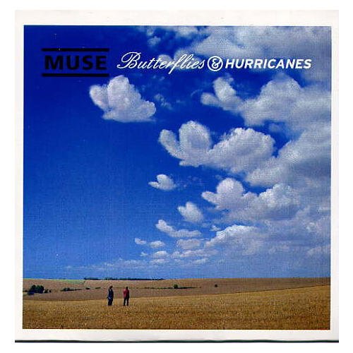
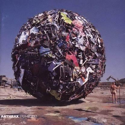
So a while ago, back in the days of the dots, I was lookin for books at Half Price Books. This was of course a hunt for imagery for the dot books. Anyway, during one of my trips into the store I stumbled upon this book titled Taken by Storm. The cover of the book is what caught my eye. It was the album cover of Audioslave's self-titled debut album. I am not a fan of Audioslave. I am a fan of the pieces of Audioslave (Tom Morello, Brad Wilk, Tim Commerford, and Chris Cornell), but that's beside the point. I noticed an album cover and immediately knew it was an album artwork book. Before I knew it, I had looked through the whole book and had spent half an hour doing so. Of course, I was brief with each page. I planned on buying the book anyway so I skimmed through, snatched it up and now have it to refer to for inspiration. I've always been interested in album artwork and came to the decision of wanting to design album artwork a few years ago. So it was natural for me to pick this book up. I did not expect the epicness that this book possessed. I knew it would be good but I didn't know that this book was just one artist's work, and I never would have guessed that this guy has done some of the best and well known album covers from the past 45 years. The designer is Storm Thorgerson, and his job is to create truly epic moments and use them as album covers. Basically. Just witness a few of my favorites and see what I mean. Really. Epic.
Butterflies and Hurricanes single-Muse
Try Anything Once-Alan Parson's Project
On Air-Alan Parson's Project
Secret Society-Europe
Deloused In the Comatorium (alt. cover)-The Mars Volta
Houses of the Holy-Led Zeppelin
The Widow single-The Mars Volta
Tree of Half Life t-shirt design-Pink Floyd
Bottom Half-Umphrey's McGee
Wish You Were Here-Pink Floyd
Stomp 442-Anthrax
Labels:
color form
Accordion Album Art
My color theory accordion book was done using album art work for the color harmonies. There are many colors present in the album artwork world, something I'm sure most people have noticed. Definitely something I've noticed, considering album artwork is my primary aim with what I plan to do as a designer. My main challenge in composing the photos was dealing with text and imagery in the artwork. For the most part I tried to find solid colors in the artwork, but I also wanted to maintain a variety in the albums the artwork was pulled from which made it a little harder to avoid all text and imagery. Also if the text and imagery was totally abandoned then the color fields become ambiguous and may not be seen as album art work at all. In fact, using just the solid color fields wouldn't be using album artwork. Album artwork is the text and imagery too. So what to do about the text and imagery to avoid distracting from the color harmonies? I tried to eliminate commonly known covers and imagery. Any imagery that would be recognizable (like Jimi Hendrix in the monochromatic purple composition) was covered up partially; just enough to remove the immediate recognition and distraction of the familiar, but still leave the color of the imagery present. As for the text, the best thing to do was to present it at angles and upside and sideways to make it harder to read. I also refrained from using whole words in any composition other than the warm, cool, and monochromatic pictures. Again looking at the purple composition, the text is arranged at angles, is for the most part on the two CDs (so the text curves) and is upside down.
The cropping was focused on close and angled compositions. The angles made the compositions dynamic, as opposed to boring simple layouts of album covers, and helped bring the feel of album artwork into the pictures. When the entire accordion book is unfolded the compositions look like a pile of CDs and cases laying on the table. The angles also allow a sense of dimensionality whereas (and it can be seen in the cool and warm compositions) the straight up and down layouts are more two dimensional.
Possibly my favorite part of the book is the Table of Contents. I have a decent mental repository of album names and their artists, and in many cases I know albums down to the songs on it and in some cases the sequence of the songs. Musical information (not so much the actual making of music, and musical knowledge) interests me a lot. I actually considered being a music historian for awhile and it's still a consideration even now. So to get back to my book, I included the names of the albums and their artists that were used in each composition. It almost makes each composition like an I-Spy book. This also allows viewers to connect to the compositions on a more personal level through the familiarization of musical artists and albums. So, I took the familiarization out of the compositions to avoid distraction, and I put it in the Table of Contents to create an interest. Now does it create a distraction because the compositions come after the Table of Contents? I don't think so, but that's a little tough to determine.
Labels:
color form
Wednesday, October 20, 2010
Blog Mod
here's the little somethin I put together for my blog. Orange and Brown color palette to go with the season and upcoming Halloween holiday, plus I just like orange and brown. The background I based on perpetual motion and energy. Essentially, all things come around and all forces are self driven.
Labels:
color form
Monday, September 27, 2010
Color Schemes
Most of my color schemes ended up being analogous. Could mean I relate a particular color to each situation more than other colors. Or at least a warmth or coolness is associated with the words.
Labels:
color form
Color Palette Brought to You by Heart On
For Color, Form, Production I chose an image to do a color study with. I made two color palettes using the colors in the image. One color palette for RGB and one for PMS. The image I pulled these colors from was a photograph I took of the album case and artwork for Heart On by the Eagles of Death Metal. The whole album scheme was a deep and clean red which goes along with the whole idea for the album.
Labels:
color form
Color Star and Me...and RGB, HEX, and PMS
Round two with the color star. I ran into the same snare. The red orange messed with me again. When I went into the pantone selection both red and red orange came out as the same pantone, but they were definitely different colors on my star. Nevertheless, a different and more suitable red orange was chosen and the rest was straight forward.
Labels:
color form
Wednesday, September 22, 2010
Emotions from Colors
bright red 186-Positive-love, passion, comfort, warmth, excitement, cheerfulness, ecstasy
Negative-hate, anger, violent, betrayal, fear, disappointment, frustration,
vibrant orange1585-Positive-relaxed, comfort, calm, meditative, quiet, joy, triumph, content, excitement Negative-frustration, jealousy, envy, hostility
bright yellow 116-Positive-Joy, Intelligent, helpful, careful, hopeful, observant
Negative-cowardice, lazy, annoying, restlessness, nervous
earth brown 438-Positive-accepting, generous, helpful, encouraging, welcoming
Negative-despair, hopelessness, solitude, bored, disappointment, stagnant, ignorance
deep blue 2747-Positive-loyalty, comfort, calm, wisdom, strength, determination, encouraging, masculine
Negative-lost, hopeless, depression, arrogant
chartreuse green 584-Positive-friendly, witty, clever, quirky, surprised
Negative-annoying, sinister, deceived,
blue purple 267-Positive- success, reassured, certain, wisdom, confidence, generous
Negative-arrogance, narcissism, forced, cramped,
charcoal gray 425-Positive-relaxed, calming, resolute, wholeness, peaceful
Negative-depression, despair, hopeless, useless, disappointment , lost, aimless
white-Positive-peace, hope, morale, anticipation,joy
Negative-emptiness, solitude,
black-Positive-openness, sturdy, strength, capable, expansive, inquisitive
Negative-loneliness, hate, grief, fear, uncertainty, hopeless, timid, nervous
Labels:
color form
Tuesday, September 21, 2010
A Beginning to Album Collage
These pictures were like a practice run for my color harmony book soon to come. All compositions are made using the album and its limited parts. There are three parts to most of my CDs: the actual disc, the casing to hold the disc, and the booklet that is held in the front panel of the case. In most cases the front of the booklet acts as the album cover too. Inside CD booklets can be a variety of things like the band members names and roles on the album, lyrics to some or all songs on the album, notes or comments made by the artists, more album artwork (some booklets just have images and no personnel or lyrics), and much more. In most instances though, if not all instances, the copyright information is on the back of the booklet.
So far i explored some of the purple, orange, and blue, hues I found in my collection. They were all done on a solid white surface too. I'm going to try putting tables and a CD player in some backgrounds and maybe have some hands holding them. With these hues I did a complimentary contrast with the blue and orange objects, and a monochromatic study with purple and blue. The images for the red picture all came from one album so it is not really a study. That is the image I am pulling my palette colors from for Color Form.
Labels:
color form
Color Experience with J A
J A as in Joseph Albers. Word. I think the thing I found most appealing was Albers' craft. In most cases you can't even tell that the images were done with paper. Many look digital not analog. I was also amazed by how many solid and clean color fields he found. The way I took it he collected most colors from scraps. Maybe I misread on that part, but regardless his palette of colors was numerous. I'm fairly familiar with a some of the illusions he creates like making one color look like two through contrast and creating after images using contrasting colors. Although experiencing these series of images in his book helped me understand them a lot more. Something that I feel like can only be done through repetition of studying color interactions.
I posted the above images from his book because of particular things I noticed in them. With the first image Albers suggests looking at both compositions up close and from a distance. When trying this I noticed that both create an intense pulsating effect when held close to the eyes and moved back and forth while still staying in close proximity to the face. This works in both compositions but is noticed far more in the orange and blue. With the second image Albers comments on a ground exchange between the hues however I simply only see the green as the ground and not the red.
Labels:
color form
Monday, September 20, 2010
Solid Red Color Study
I chose this album to do a one solid color study because the red tone used in it is the same for the cover, the booklet, and the cd. There are other tints and shades of red but the dominant one is primary red.
Labels:
color form
Saturday, September 18, 2010
The Stones Perfect Logo
Lil' Logo Lesson
The Tongue and Lips logo was the icon of of the world famous English rock and roll band. The logo spoke volumes for the band and helped make them one of the most recognizable groups ever. The band formed in 1962 and put their first album out in 1964. As many know, they formed in the U.K. and shortly after became part of the British Invasion movement in the U.S. alongside their musical rivals the Beatles.
In 1971 the album Sticky Fingers was released and was the first Rolling Stones album to feature the Tongue and Lips logo. The logo was designed by a student at the time by the name John Pasche. Pasche, in my opinion, was lucky to have his design chosen by the band. Or should I say the Rolling Stones were lucky to stumble upon Pasche at the Royal College of Art. Needless to say, the collaboration created one of the worlds most popular images. This largely came from the status of the band itself, but may have been helped by the powerful logo as well.
The album Sticky Fingers was also designed by Andy Warhol. The cover was designed by Warhol and the original vinyl covers were made with a real zipper that would open the pants of the person on the cover.
The concept of the logo is pretty straight forward. Mick Jagger has a huge mouth. Pasche even commented on the issue about the logo design. The tongue also represents the hard rock, gritty, rebellious attitude the Rolling Stones radiated. The solid bright red color provokes deep emotions. Passion and excitement are strongly suggested through the color and image combination. The band strongly focused on the raw emotions people experience in life. All in all, I really don’t think a better logo could’ve been made for the band. It represents the frontman, their emotion, their passion, and their attitude perfectly. Its so raw.
John Pasche Bio
John Pasche, most recognized for the tongue and lips logo for the Rolling Stones, is a British designer that has done work for various music artists, a few event and advertisement posters, and has claimed several awards from his endeavors.
Pasche attended Brighton College of Art from 1963 until 1967 when he received his Bachelor of Arts in graphic design. He then went on to the Royal College of Art in London and received his Master of Arts in 1970. While at the Royal College of Art Pasche designed a poster for the film Judex in 1969, and then another poster for the film And God Created Woman in 1970.
After graduating from the Royal College of Art, Pasche began working with the Rolling Stones on poster designs and eventually their iconic logo. From 1970 to 1974 he created four different tour posters for the Stones. In 1970 he created the tongue and lip logo and it was first used in 1971 on the album Sticky Fingers. Mick Jagger had apparently gone to the Royal College in 1969 hoping to find images to represent the band. Pasche’s image was chosen and history was set. Referring to the logo, Pasche said that one of the first things one could notice about Jagger was the size of his lips and mouth.
Pasche’s also done other work for musicians like The Who, Paul McCartney, The Stranglers, Dr. Feelgood, Jimi Hendrix (his studios not the actual person) Judas Priest, and David Bowie. He is also known several projects done for Chrysalis Records.
Throughout his career, Pasche has received several awards. His first award, and one of the most notable, is IPA award Best Graphic Design Student at the Royal College of Art. He’s also won several awards for album sleeves and commercial and sale designs. He now works as a freelance graphic designer in Surrey, England.
Here's pics of the original design for the logo, the logo now, the album cover of Sticky Fingers designed by Andy Warhol, and an inner slave with the first published Rolling Stones logo.
Labels:
color form
Tuesday, September 14, 2010
Thoughts on Color Harmony
I was fairly familiar with color harmonies, but of the basic harmonies there were two I was unaware of. Split complimentary and double complimentary were new to me. Complementary colors I've been aware of since I was kid. My favorite set of complimentary colors are orange and blue mostly because orange is my favorite color. Analogous, triadic, and monochromatic are simple combinations and probably the least appealing to me. I'm pretty interested with working with split and double complimentary harmonies. The concept is new and I'm interested to see what I can learn about these harmonies and see if understanding these harmonies will help me understand all color relations a little better.
Labels:
color form
Monday, September 13, 2010
Itten Color Star
Here's my Itten color Star. The activity was simple and helped me establish a better eye for tints and shades. Working with the yellow orange, orange, red orange, and red was the trickiest part. Most of the hues were very similar and some trial and error had to take place to get the shades just right (or seemingly right).
Labels:
color form
Tuesday, September 7, 2010
Logo variations (color form)

Out of the twenty variations done on my logo, these three are some of my favorites. The first one is a reminder of how the Rolling Stones and other British Invasion bands forced themselves on everyone here in America. British Invasion enforced with Russian constructivist aesthetics and ideals. Sounds threatening.
The second is a pattern created by using the logo without overlapping the logo. A nice negative space is created between the logos which complements the shape of the logo very well. It reminds me of old floral patterns that are set on grids so the flowers hardly overlap but can be seen in a grid pattern.
The final one is my overall favorite for a few reasons. I like working with letters to see how they can be drawn while maintaining legibility. Also, the closed counter spaces are replaced with eyes in this rendition of the logo. Each eye possess a graphic and cartoon aesthetic and each eye shows a different emotion. These emotions in a way reflect many themes behind the Rolling Stones music. The Rolling Stones were the equivalent of the Beatles, except not all their songs were generally happy and about love. Many dealt with real world situations and addressed complex emotions and issues in the world. I just don't know if the graphic style of the eyes expresses the realness of the Rolling Stones though.
Labels:
color form
Sunday, August 29, 2010
Live Trace and the Corrected
live traces of the rolling stones logo. Which I chose because music logos are my favorite logos. They always say a lot about the band and are usually iconic and really just epic feeling (good ones anyway).
Labels:
color form
Subscribe to:
Posts (Atom)