

Showing posts with label viscom. Show all posts
Showing posts with label viscom. Show all posts
Friday, December 10, 2010

Past Project Critique (viscom fall 2010)


The first motif was the original direction I was trying to take my "Tries walking backward" motif. It was changed to the second motif in order to portray a more haptic quality. The "Windy winter rain" motif was haptic already and I needed to establish a better cohesion amongst all my motifs. Since I had a set of haptic and clean motifs for the umbrella, I needed only refine my walking motif. The original motif was also more open and not as contained as the other motifs. This was changed by removing some footprints, bringing them closer together, and putting the dimensionality of the motif on an angle.
Semester Reflection (viscom 1 Fall 2010)
This semester...
There was a lot. A lot to take in. A lot to learn. And a lot learned. It all flew by quick but when I look back at the quality of my work at the beginning of the semester (concerning what I will call the three "c's"––craft, cohesion, and clarity) I have improved greatly on all three. All three are essential in design work, and in my opinion (at least for now) are the most important aspects of design. I will be certain to exercise these aspects of design and to continue executing them in my work for the years to come.
In addition to design formalities, I really learned how to work more effectively. I have always been a good student and entirely dedicated to getting my work done no matter what needed to be done. I had never had trouble delivering assignments until the first project this year. Not being able to deliver that project really messed with me on several levels. I had totally lost faith in myself, in my work, and in my direction in life. I was basically aimless for short period of time, just trying to get by until the winter break when I could stop and think about what I wanted to do. However, a solution and level of comfort came sooner than expected.
I learned not to doubt myself and to put more confidence in myself. I had given up for a little while and I think after getting back into the game mid semester I won't let it happen again. I know how to work better, and I now know (looking back at the month of september with a clear and better rested mind) that I had worked very inefficiently for awhile (even in high school). I was able to correct this habit when I realized where all my time had gone in September. My focus also improved over the semester and I think I've found a few ways to keep it stronger and to stay on task better. I often find my mind wandering while I work on anything. I have slowly been able to contain the lack of focus. The best way I found to do this is by simply catching my mind wandering and getting to work immediately again. I still haven't found a way to prevent my mind from wandering in the first place and I don't think I ever will. I've always embraced this and looked at this kind of absent mindedness as a strength. I just have to let it occur less often and in more controlled ways. Basically, this semester my commitment to my work hasn't changed, but the way I work has greatly and this is what I needed more than anything.
There was a lot. A lot to take in. A lot to learn. And a lot learned. It all flew by quick but when I look back at the quality of my work at the beginning of the semester (concerning what I will call the three "c's"––craft, cohesion, and clarity) I have improved greatly on all three. All three are essential in design work, and in my opinion (at least for now) are the most important aspects of design. I will be certain to exercise these aspects of design and to continue executing them in my work for the years to come.
In addition to design formalities, I really learned how to work more effectively. I have always been a good student and entirely dedicated to getting my work done no matter what needed to be done. I had never had trouble delivering assignments until the first project this year. Not being able to deliver that project really messed with me on several levels. I had totally lost faith in myself, in my work, and in my direction in life. I was basically aimless for short period of time, just trying to get by until the winter break when I could stop and think about what I wanted to do. However, a solution and level of comfort came sooner than expected.
I learned not to doubt myself and to put more confidence in myself. I had given up for a little while and I think after getting back into the game mid semester I won't let it happen again. I know how to work better, and I now know (looking back at the month of september with a clear and better rested mind) that I had worked very inefficiently for awhile (even in high school). I was able to correct this habit when I realized where all my time had gone in September. My focus also improved over the semester and I think I've found a few ways to keep it stronger and to stay on task better. I often find my mind wandering while I work on anything. I have slowly been able to contain the lack of focus. The best way I found to do this is by simply catching my mind wandering and getting to work immediately again. I still haven't found a way to prevent my mind from wandering in the first place and I don't think I ever will. I've always embraced this and looked at this kind of absent mindedness as a strength. I just have to let it occur less often and in more controlled ways. Basically, this semester my commitment to my work hasn't changed, but the way I work has greatly and this is what I needed more than anything.
Refined Final Haiku Animation
After critique I decided that the walking motif entry needed to zoom out a little bit to see that the motif is walking and the cloud motif needed to enter in a little more interesting angle. Just zooming out was a little dull. I avoided using music because I wanted it to be visually engaging. I also really didn't think much music would be acceptable to put to the haiku.
Final Statement (project 3 Fall 2010)
My priority in this project was to establish a cohesiveness in my motifs. For the past two assignment in viscom I had not done so well at making all my series of works cohesive. I had begun to attempt this with the line poster project, and I had pretty much missed it entirely in the dot book. At one point, I had ended up with two sets of umbrella motifs (one clean and one haptic), a solid wind motif (that was only nice after a bunch of iterations on the wind swirls), and what I thought was a good walking backward motif. It ended up being that the walking motif was too clean to match up with the windy rain motif. As for the umbrellas, either motif I chose could work depending on whether or not I wanted to go a haptic route or clean route. Haptic was chosen and the walking motif was redone. This time with a janky set of legs and some foot print splatters as opposed to clean foot prints. This haptic quality enforced the conflict that exists in the haiku.
For the animation I tried to transition the motifs in the most natural way possible. I wanted them to enter and exit that made sense for the line. The cloud rolls on in and rolls out. The wind swirls onto and off the screen. The umbrella is a little unnatural in its entry when it just comes onto the page to cover up the wind and rain. It exits though by blowing around and off the page. Then the walking motif enters by actually walking and making the footprints. Then the legs fill the screen to transition back into the fully black screen with the cloud.
For the animation I tried to transition the motifs in the most natural way possible. I wanted them to enter and exit that made sense for the line. The cloud rolls on in and rolls out. The wind swirls onto and off the screen. The umbrella is a little unnatural in its entry when it just comes onto the page to cover up the wind and rain. It exits though by blowing around and off the page. Then the walking motif enters by actually walking and making the footprints. Then the legs fill the screen to transition back into the fully black screen with the cloud.
Taxonomy Book Documentation
Windy winter rain


My silly big umbrella
Tries walking backward
In the haiku there is a conflict between the umbrella (man) and wind (nature). Hence the title of the taxonomy book. The book was divided and binded based on this concept. The paper has a somewhat natural color and the rivets provide the idea of man. The haiku also has a child like quality to it so the placement of marks was carried out in a fashion that created a kind of narrative. The marks are not simply placed in the center of the pages for display. They move around the pages and bleed off the pages and some interact with each other. The type face was chosen to resemble the type used in children's books. When doing my Reach Out and Read poster for Typography 1, I needed to acquire some children's books to cut my analog letters out of. Almost every book I looked at used a serif typeface. Finally, a little combination of mine and McKenzie's motifs was added to the front to display the child like quality of the the haiku and the conflict between man and nature.


Final Haiku Storyboard

Final Digital Motifs
Was limited to two sets. A serif and a sans serif. Futura bold and Hoefler Black. These are the chosen.


Tuesday, December 7, 2010
Venezky Philosophy
Martin Venezky is a designer and teacher at the California College of Arts in San Francisco. He specifically teaches typography at the school and is best known for his appreciation of typographic rhythms and patterns. As a designer Venezky maintains a personal and close connection to the materials he uses. This close relationship often results in a series of frequent transitions between hand crafted and digitally manipulated aesthetics. The closeness allows the designer to think properly about the material and to know when analog craftsmanship is needed and when digital craft is needed.
This awareness of the material is very interesting and I feel that this idea of shifting between analog and digital media is absolutely essential in design. It is also a concept I was not fully aware of when I entered the design program. Since being in the program, I have come a long way in understanding the use of materials and understanding when to work analog and when to work digitally. I still have a long way to go though.
The collage that Venezky shows and cites in the book It's Beautiful then Gone is claimed to be a representation of his philosophy. He believes that art and life are eternally connected and that they should constantly grow and learn together. In his collage work, each piece of the whole is connected, but these connections must be found and created. In life, there are many ideas and motives that drive and guide us. As artists, as people even, we must notice these motives and ideas and find the connections between them to see where we have been, where we are, and where we're going. This philosophy is just like me happening upon several books this semester. I found an album artwork book, a book by Leo Lionni, and a book about Nikola Tesla. None of these books have anything in common, except that each has pushed me to learn and to motivate myself to learn on my own. They have all also convinced me to quit thinking so much and just start doing. I still think a lot and have my whole life, so making this transition will not be easy I'm sure. But I've made my first step in that direction by acknowledging what needs to be done, and I couldn't have done it if I wasn't so open to finding the various connections in my life that hold together most of my philosophical weight.
This awareness of the material is very interesting and I feel that this idea of shifting between analog and digital media is absolutely essential in design. It is also a concept I was not fully aware of when I entered the design program. Since being in the program, I have come a long way in understanding the use of materials and understanding when to work analog and when to work digitally. I still have a long way to go though.
The collage that Venezky shows and cites in the book It's Beautiful then Gone is claimed to be a representation of his philosophy. He believes that art and life are eternally connected and that they should constantly grow and learn together. In his collage work, each piece of the whole is connected, but these connections must be found and created. In life, there are many ideas and motives that drive and guide us. As artists, as people even, we must notice these motives and ideas and find the connections between them to see where we have been, where we are, and where we're going. This philosophy is just like me happening upon several books this semester. I found an album artwork book, a book by Leo Lionni, and a book about Nikola Tesla. None of these books have anything in common, except that each has pushed me to learn and to motivate myself to learn on my own. They have all also convinced me to quit thinking so much and just start doing. I still think a lot and have my whole life, so making this transition will not be easy I'm sure. But I've made my first step in that direction by acknowledging what needs to be done, and I couldn't have done it if I wasn't so open to finding the various connections in my life that hold together most of my philosophical weight.
Friday, December 3, 2010
Final Haiku Animation
For the first attempt at the animation, in the rain motif the windy rain was panned in as it rotated. I stopped the rotating when the text appeared to showcase the motif in a way and then panned the rain off the screen as it rotated again. The change for my final video was to keep the windy rain rotating the entire time it was on screen.
For the umbrella the motion tween was a little shake. This was cleaned up and I added this little flutter for the umbrella to descend on the screen. It slows down as it is being blown around the screen and floats toward the bottom of the screen before being swept away again.
The walking motif used the same idea with the legs walking and making the footprints, but instead of viewing it all on screen and at the motif size, I zoomed in on the foot prints and panned the camera along as the legs made each foot step. Finally, a little weeble wobble was added to the legs to further support the "tries" to walk backward.
Monday, November 22, 2010
Refined Haiku Storyboard and A to B Transition
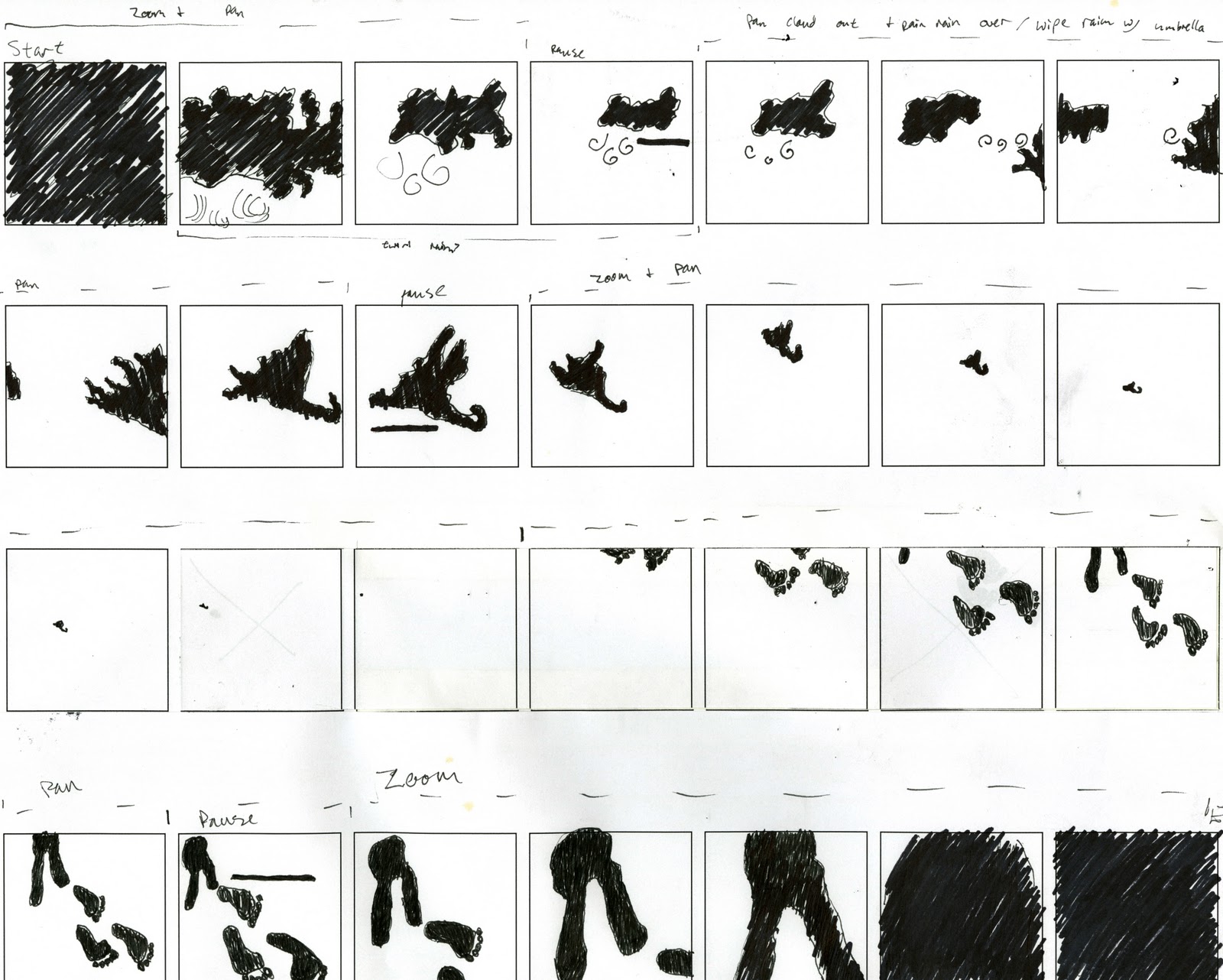
Above is my refined storyboard. After a small group critique however, I have decided I will modify a few aspects of the transitions. I also plan to animate the text but plan on keeping it really simple, just to keep it from awkwardly popping up.
Below is the first result of the storyboard. It is a transition from the beginning of the video to the entrance of the umbrella and the second line in the haiku.
Pual Rand and Stefan Bucher
Paul Rand was a graphic artist known for a few corporate logos, including logos for IBM, UPS, Enron, Westinghouse, and ABC. He is also known for his design philosophies and as an influence on the Swiss Style used in graphic design. He strongly opposed postmodernist design theory. He believed in a perfect balance between form and content. He said that too much form and the design loses meaning and too much content and the form loses interest. This balance is an objective all designers strive (or should strive) for.
This concept that Stefan employed in making his monsters is extremely similar to the motifs we made for our haikus. He saw the form in the blobs like we looked for the forms to match our thumbnails in the pages and pages of blobs and marks we had. We had to tie the two forms together to create something that had a balance of content and form.
Stefan G. Bucher is writer, illustrator, and graphic designer. He is in charge of the design studio 344 Design in California. He is best known for his animation series Daily Monster, in which he drew a new monster and filmed himself everyday for 100 days. He then posted these drawings and videos and viewers would comment and write stories about the monsters. These drawings and stories were later compiled into a book called 100 Days of Monsters. The series has been featured in Communication Arts Illustration and American Illustration annuals and was recognized by the New York chapter of AIGA.
I particularly take to Stefan's philosophy about how he lets the images form. He doesn't form them himself entirely. Some of the creating is in the happening. It's a little like chaos theory. He makes a Rorschach-like blob and finds the monster within. He only controls the form of the blob to a certain extent. The rest is really unpredictable. I also liked what he says about his preference for monsters. He claims that he has no preference for monsters and that he didn't choose to start drawing monsters, but the monsters chose him. He also talks about how he sees these ideas and others can't, so in a way it's his duty to let people see them.
This concept that Stefan employed in making his monsters is extremely similar to the motifs we made for our haikus. He saw the form in the blobs like we looked for the forms to match our thumbnails in the pages and pages of blobs and marks we had. We had to tie the two forms together to create something that had a balance of content and form.
Friday, November 19, 2010
Haiku Storyboard Sketches


Thursday, November 18, 2010
Final Motifs with Text


I'm torn between the two because the color balance of black to white in the Futura Bold is nearly the same as the black and white balance in the motifs. On the other hand the form of the Hoefler Black with its elegant and rounded serifs reflects the form of my motifs better.
Wednesday, November 17, 2010
Time and Motion Response (and a little Liquid 9)
Some serendipity again? I think so. Today I joined AIGA for the first time in one of their studio visits, and I will have to say that it was a good visit to begin my involvement with AIGA. We went to visit Liquid 9's studio. This was the first time I've ever seen a design studio in person and it was really everything I could have hoped for and even more (the basement was used as a place to record and play music!). What really blew my mind was how expansive Liquid 9's work was. They covered a lot of aspects of design and it really seemed (or maybe my bias just took over) like they focused a lot on designing for musicians. As I've said several times before, designing album artwork and other artwork for musicians (t-shirts, logos, and music videos) is my primary aim with my design work. And they did all of this. The music videos they showed us were amazing and really captured the mood behind each artist. Although I was a little disappointed to see designs and videos primarily for rappers, I was still just dumbfounded by the work they did.
So where does the serendipity come into play? Just a few hours before we visited the studio we had learned about storyboards and movement in animation. Storyboards were essential in the making of Liquid 9's videos. They also used several of the transitional elements we talked about in class in some of their videos. Watching these videos and listening to the members of Liquid 9 talk about the constant communication between the musicians and the designers just amplified the need for storyboards. When done well, storyboards provide a great visual of the progress of a video. Since the designers are dealing with frames, changes and improvements can fairly easily be integrated into the storyboard in a nice and neat way.
So where does the serendipity come into play? Just a few hours before we visited the studio we had learned about storyboards and movement in animation. Storyboards were essential in the making of Liquid 9's videos. They also used several of the transitional elements we talked about in class in some of their videos. Watching these videos and listening to the members of Liquid 9 talk about the constant communication between the musicians and the designers just amplified the need for storyboards. When done well, storyboards provide a great visual of the progress of a video. Since the designers are dealing with frames, changes and improvements can fairly easily be integrated into the storyboard in a nice and neat way.
Sunday, November 14, 2010
Taxonomy Organization

A working idea right now is to include a photograph of the object and a silhouette of the object to act as a divider page for each item.
Thumbnails to Motifs
Mackenzie and I chose two haikus that we thought had the best visual picture portrayed by the lines of the poem. We originally had around fifteen selected from various sources and decided on one of the haikus Mackenzie found and one that I had found. The first, and rejected haiku, is:
Empty trees, bare bone
Dancing skeletons caper
Hear the howling wind.
These are the ten thumbnails produced for each line.


The second haiku, and the one that we decided to continue the project with, is:
Windy winter rain
My silly big umbrella
Tries walking backward
These are the ten thumbnails for each line, and also the first round of iterations for the haiku sketches to be used in our final project.


Second round of iterations.


Windy winter rain


My silly big umbrella


Tries walking backward


Subscribe to:
Posts (Atom)