
Showing posts with label viscom 2. Show all posts
Showing posts with label viscom 2. Show all posts
Tuesday, April 12, 2011
Two Symbols in One (reading response)
This reading brought up the idea of juxtaposition which I really like. When working on my designer poster for Typography II, I came across a lot of juxtaposition in his work. When juxtaposing things the message can often be changed or a greater understanding of the idea can be seen. This is what we are trying to accomplish in relaying and anchoring our icons with text and image.

Monday, April 11, 2011
Icon/Culture Exhibition Titles
I currently have four ideas I'm working with for exhibition concepts.
The first is the idea of money as the foundation for life. My culture of outlaws came about during the Great Depression when jobs were scarce and money was short for everyone. Many people took up lives of crime to avoid the difficulty and impossibility of finding a job. This exhibition would be named "yEARN".
The second idea concerns the power of these criminals, especially the Mafia. The title here would be "Powered by Criminals" or "Criminal Power".
The third idea is based on the clean, dapper, and organized side of the Mafia. This is the unexpected side of the Mafia, and one people look over due to the dirty violence. The title here is "Criminal Filth" or "Organized Filth".
My last idea is based entirely on the act of the prohibition. It would deal with the split in the population over whether or not alcohol should be prohibited and if it really had been considering alcohol's accessability during the prohibition. The laws were enacted to clean up America, but made it dirtier in the process. Title here is "Prohibited?"
The first is the idea of money as the foundation for life. My culture of outlaws came about during the Great Depression when jobs were scarce and money was short for everyone. Many people took up lives of crime to avoid the difficulty and impossibility of finding a job. This exhibition would be named "yEARN".
The second idea concerns the power of these criminals, especially the Mafia. The title here would be "Powered by Criminals" or "Criminal Power".
The third idea is based on the clean, dapper, and organized side of the Mafia. This is the unexpected side of the Mafia, and one people look over due to the dirty violence. The title here is "Criminal Filth" or "Organized Filth".
My last idea is based entirely on the act of the prohibition. It would deal with the split in the population over whether or not alcohol should be prohibited and if it really had been considering alcohol's accessability during the prohibition. The laws were enacted to clean up America, but made it dirtier in the process. Title here is "Prohibited?"
Friday, April 8, 2011
Crime Pays: INFORMATION GRAPHIC FINAL


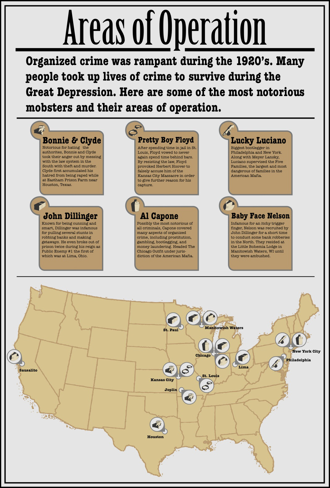

In my timeline of Al Capone I use the icons to signify key moments in his life. I break it down into movement (car), violence (gun), notoriety (hat), and imprisonment. In the map I use the icons to refer to different outlaws. The icon and outlaw relationship is a little arbitrary but is also significant in some cases, like Capone was largely known for his involvement with bootlegging alcohol. Lucky Luciano is known for establishing the American Mafia, which I think the tommy gun could symbolize all on its own. The car refers to Bonnie and Clyde because they were on the run the entire time their crime streak was in effect. Finally the cash is used to symbolize Dillinger because he made a living robbing banks. The cash is then used again to express quantity in the Dillinger graph. The graph is totally about monetary values so the icon is entirely appropriate in its use.
Although I had a hard time translating my cultures information into information graphics, I still learned about how to make them and how to think about quantitative data in a visual way. I will continue to research and observe information graphics. I really want to be able to someday achieve some very complex information graphics that have multiple levels of information and readability.
Thursday, April 7, 2011
Style options


I'm leaning toward the the timeline with the lines but was concerned whether or not it went well with rendering of the text boxes in the map (or if the difference in style mattered at all).
Sunday, April 3, 2011
From Research, to Sketches, to Infographs

Dollar Bill Layout
Labels for the various insignia, codes, and other such legal obligations that are printed on American Currency.
http://www.ischool.utexas.edu/~jpwms/mixednumbers/money.html

One of two John Dillinger graphs. This one charts some interesting numerical values he encountered in his bank robbing days. It mostly shows some fun facts for the bank robber like how many times he was shot at his ambush, how many police officers and FBI agents there were to arrest him at the ambush, how many people he killed during his escapade, etc.
http://www.billlucey.com/2009/06/john-dillinger-fast-facts.html

This is a map showing the various urban locations of the Mafia in the United States.
http://www.americanmafia.com/26_Family_Cities.html

Another John Dillinger graph. This one shows some particular cash values that were attributed to him at different times in his life like the reward for his capture/info on his whereabouts, his total accumulation of money from bank robberies, and the amount of money in his pocket at his death.
http://www.billlucey.com/2009/06/john-dillinger-fast-facts.html

A timeline of Al Capone's life. It charts his life from the moving of his parents to the U.S. to his death.
http://timelines.com/topics/al-capone

Timeline of the Prohibition on alcohol in the U.S.
http://americanhistory.about.com/od/prohibitionera/a/prohibition.htm

Timeline of Bonnie and Clyde's killing spree.
My Life with Bonnie & Clyde by Blanche Barrow

A map of where Bonnie and Clyde had killed a person or people in there attempts to stay away from the authorities.
http://en.wikipedia.org/wiki/Bonnie_and_Clyde#The_spree

A graph showing the rise in crime rates & federal prison expenditure and occupation.
http://www.albany.edu/~wm731882/organized_crime1_final.html
These infograph sketches were then transformed into the following six. These six graphs were a push in finalizing the content of the graphs. We also decided at this point which infographics were worth keeping and which weren't. These all also begin to explore the type that will be used for the infographics.


A differentiation between the civilian and police officer killings was made and implemented in this iteration.

The graph was broken into two graphs to showcase one for crime rates and the other for penal institution expenditure and inmate population.

The two John Dillinger graphs were combined to draw a connection between the two. The random numbers happened because of his time robbing banks and the cash values exist because of the same reason.

Some more minor cities dropped from the map to clear up space.

The level of drank in each jug references the amount of illegally distilled liquor that was being purchased throughout the course of the Prohibition/Temperance movement. There is no actual quantitative value attributed to the amount, but the increase is only there to imply the increase.
These six then became the following six. These six begin to explore style choices, and at this time had been narrowed down to four infographics. Stylistically, I wanted to reference the 3D elements and the spotlight-like harsh contrast of my icons.


Reading Response (infographics)
Appealing facts, mass statistics, mind-boggling numbers, and layers of information. These are a few strong factors that make information graphics appealing. In The Numbers Man reading Feltron mentions how people are drawn to the density and particular obsessiveness of information graphics. The density of statistics is overwhelming in consideration but when presented properly and effectively should be comprehensible simply by viewing. The actual factual quantity or amount in an information graphic is shown through size and set increments in graphing. This is part of the primary function of information graphics: to visually display information. The actuality of the information may be enormous but is taken and displayed in a way that is accessible, and better yet visually accessible. Some information graphics can, and should, convey information without the viewer having to read anything. In the Lupton reading, Lupton writes, "The literate human mind has no difficulty switching between seeing and reading." This is what we have been striving for in our information graphics, displaying factual, quantitative information that can be seen as easily as read.
Sunday, March 27, 2011
Find and Share (Info Graphics2)

(link to the interactive information graphic)
I came across this infograph while looking for something to influence my set of infographs in an aesthetic way. The linear layout of this page of the infograph is what initially caught my eye. When I opened the page and saw that it had multiple pages of information I was immediately compelled to look at every page. The chart breaks down the types of energy used in the U.S. It then shows where this generated energy goes. The generated energy is then broken into two groups: electricity and energy consumption. This shows what amounts of generated energy are directly consumed and are converted to electricity for later use. The two groups (energy consumed and electricity) then branch apart and show what amount of each is used and wasted. The linear chart here shows the overall generation, use, and waste of energy. Clicking on any source of energy or the lone electricity will take you to a page with a pie chart showing how that particular form of energy is distributed between the four forms of consumption (transport, industrial, residential, and commercial). If you click on the energy consumers it shows where they get their energy and how much is used and wasted.
Its a really cool and simple infographic and personally resonates with me through its interactivity, multiple layers of information, and the content. I was appalled to see that over half of the energy generated in the U.S. is wasted. I don't know how it compares to other countries for certain, but it is such a great disappointment.
Sunday, March 20, 2011
Find and Share (Info Graphics)


Aside from the nice conceptual side I think this set is a little odd. Mostly because it seems that there are a lot of arbitrary elements in each infographic. For example, the helicopter above the ruler in the first infographic, the word light in the second graphic, and the car and stoplight in the final graphic. They just seem a little quirky and useless in the message of the graphics. I can kind of make a tie between the "arbitrary graphics" and the rest of the image, but the connection is distant and odd. Like with the helicopter, I think its just another example of height, which the infographic is focused on. But why a helicopter? So my final conclusion with this set of infographics isn't that they are bad. Quite the contrary really, I do like them. I think its just the context of the culture they are in, which I believe is Japanese. So maybe in Asia it all makes sense. There is no doubt they have a different aesthetic than the West.
Evolution of Booze

Final Icon Set with Color

The icon set was rendered in a fashion that alluded to the visual concept of a harsh spotlight shining in a criminals face while he's being questioned by the police. Hence the three-dimensional/high contrast rendering of each icon. Photographs of four out of the six objects were taken into the photo room and photographed with a spotlight shining on them giving them the high aesthetic I was looking for. It also allowed me to set them with the same general viewpoint, The gritty sepia and gray colors allude to the black and white news papers of the time.
Edge lines were drawn in on each icon to help divide the white inside the icon from the negative space around the icon. Since the two bleed together in the one color set these edge lines were extended from tiny little stubs that suggested the edge to a more complete line that truly defined the edge. In the two color set the two colors work together to establish a better legibility of each icon.
Particularly, a couple of modifications were made to the stack of money and alcohol jug to make them more legible. The jug began as a bottle, then was two bottles, then it was a jug with a glass (and it looked like a thermos), then it was just a jug (but the handle was still messed up), and finally it was rotated and it pulled it off. The money had a few too many indentions in it and had no band around it at first. Knocking out some of those indentions and adding the band to it kept it from looking like a brick and made it look like a stack of cash.
The extended edges of each icon and the same general angle were used to establish a cohesiveness in the icon set. The amount of black to white space also serves as a unifier although on a lesser value.
Wednesday, March 9, 2011
Color Icons and Icon Color Palette


Sunday, March 6, 2011
Icons Meet the Digital World v. 1.0 &2.0
Here is the first translation into the digital realm for my set of gangster icons. This first digital set is really just a scan of finalized hand drawn icons. The levels were modified to make them solid black and white.


Second digital versions. The lines were the black reaches into the white to define some edges in the icons were all made to be the same width and have the same rounded ends. This was done to establish a more uniform set of icons. The style and black/white ratio isn't quite enough yet.


Subscribe to:
Posts (Atom)