Labels

Showing posts with label typography 2. Show all posts

Wednesday, May 4, 2011

Gangsters, Magazines, & Ipads: FINAL

MAGAZINE SPREADS
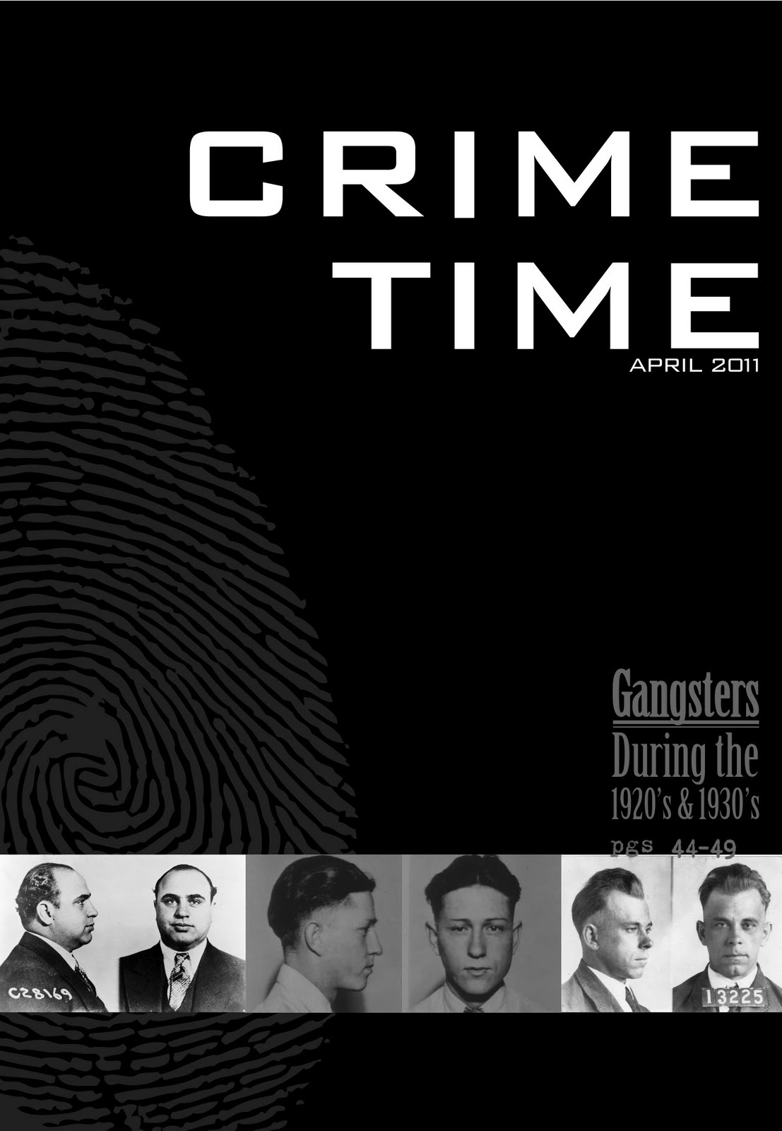
cover

opening spread (spread 1)

spread 2

spread 3

IPAD APPLICATION

Pull quote interaction


 Directory interaction

Inforgraphic interaction
 

MAGAZINE SPREADS
When creating my layouts for the magazine, I used a 7 column grid so that I could allow for several narrow columns per layout. The narrow columns allude to the newspaper aesthetic I have used for this culture and also allow for a clear viewing of the grid that is employed in the spreads. I also use some "pinstripes" to emphasize the grid and allude to the pinstripe suits many mobsters wore during the time period. I wanted to emphasize the gridded structure of the spreads to indicate a higher level of organization that may not typically be seen in magazine layouts. This level of organization is supposed to suggest the idea of organization in crime that originated with these mobsters. 

IPAD APPLICATION
In creating my iPad app, I used the color red to indicate moments of interaction. This color is very dominant compared to the other neutral colors used in the app. My first moment of interaction is a pull quote highlight, which highlights the pull quote in context within the body copy. The user presses one of the red quote marks to highlight the quote in context. The second moment is a look at the directory of the app. Here the user can touch the magnifying glass and move it along the scroll bar to see the pages available for viewing. The last interaction is a three part interaction with the infographic. The user taps the little bullseye button to expand the infograph. Then the user can tap any of the icons to receive more information on the particular mobster indicated by the icon. This information is a showing of their areas of operation in the United States, a photo gallery of images of the mobster (like a wanted poster and mug shots), and a video depicting the gangster in popular culture. Shown in my example are a wanted poster  and a mugshot for John Dillinger as well as a preview from the film Public Enemies which is about Dillinger's escapade as "public enemy #1."


Wednesday, April 20, 2011

Zines for the Pad

Several things caught my attention in these videos showing magazines on the Ipad. First of all, this whole concept is far cooler than I had expected. Some really new and innovative things came out of this and that is exactly what I didn't expect. The idea of getting a full 360 degree view of products in magazines was an awesome idea and the magazine directory is also awesome. The magazine directory allows quick navigation throughout a magazine without thumbing through pages and searching the table of contents. The coolest part I saw in innovations was the visual footnotes. This allowed the footnote in text to be clicked on and shown. No searching at the bottom of a page for a lame resource. Now you can click and be shown the resource.

These looks at magazines on the Ipad really changed my mind with the Ipad and its everyday innovative aspects. Up til now I think I've only seen ordinary computer things done on an Ipad, but only touched instead of clicked.

Sunday, April 17, 2011

Gangster Magazine Layouts

These first three spreads are explorations for a typographic and layout style of my magazine spreads. These are just the cover spread for the article. The article that I chose for the spreads is a combination of two articles. The first is a look at the Depression Era outlaws in general and the the second focuses on the Mafia in the U.S. The first spread was the chosen direction in terms of typographic hierarchy with the subheads and the page number placement. 

I chose to use fairly narrow columns and a number of columns on each page to emphasize the idea of newspaper spreads and layouts. The outlaw culture of the Depression Era was extremely notorious and many of the outlaws frequented newspaper headlines throughout the country. 


In this set of iterations I really wanted to get the gridded layout down to allow a nice amount of space around all the elements of the page. I do not want my spreads to be as dense as newspaper layouts. The first spread introduces the gangsters of the era and gives some information on the origins of the outlaws. The accompanying infograph shows the areas of influence of a few of the most notorious gangsters of the time. The second spread is a focus on the American Mafia. It gives general info on the Mafia and the Mafia during the Prohibition/Depression. The infograph is a timeline of Al Capone's life. The final spread is about bank robberies of the era and the capture of the most infamous of all bank robbers, John Dillinger. The infograph is a chart of monetary values that were tagged on Dillinger during his reign as Public Enemy #1. 

I will keep these layouts essentially the same continuing into the next phase. Some elements will be introduced to continue making the spreads more visually interesting and ideal for the culture.


Tuesday, April 12, 2011

Grids as a Frame (reading response)

Without doubt I found Jacques Derrida's assessment of the frame the most interesting thing in this reading. I even love the ideas of geometric, rational grids and the golden rectangle. I appreciate these concepts because of their rigid mathematical basis. The philosophy of the frame blows this stuff out of the water though. 

Lupton calls the page a frame and then follows this up with an explanation of Derrida's philosophy on the frame. In short, Derrida says that the frame calls attention to an artistic piece and sets it apart from the everyday world. He says it acts as in a formal way but is not seen as a form. It sits aside and in the back in a way but it could not be considered a background. Grids do this whenever a designer breaks a grid with certain elements. When a composition sits in a tight grid, the elements that break the grid have a greater attention drawn to them based on the way the element is positioned or "framed" on the page. Whatever the work is featured on is a frame too. It has a presence and it calls out the content that it features, but it is overlooked when the artwork or content is at the center of attention.

Final Peter Saville Poster and Postcard


Final poster and postcard turned in for critique. I had three goals to accomplish in the making of the poster influenced by Peter Saville's design philosophy and work. 

The first was to use a juxtaposition in type and in image. The type is a combination of Univers and Trajan––one modern sans-serif and the other an old serif typeface. The imagery is a combination of the organic chandelier in Vanderslice Hall and a rigid pattern. 

The second goal was to represent Vanderslice Hall in a way that didn't make any obvious reference. I set out to do this with the photograph of the chandelier and other key features of Vanderslice. The chandelier, however, was the chosen direction because it had the feel of Vanderslice with the classic organic structure, but it wasn't too clear. 

The third goal was to limit the poster to only what was necessary. This was hard to do typographically. At first. I finally decided to use the type to underline the main aspects of the lecture (the title, the artist, and the time). Since the poster was meant for the student audience here at the Kansas City Art Institute the location is implied. 

The exact same ideas were applied to the postcard. The yellow letters become hard to read on the white however. This could be good or bad, considering I wanted the secondary information to be subtle. Might be too subtle though.

Sunday, April 3, 2011

If You See this Vote

These are a final set of iterations on my Peter Saville poster. So I've asked a few people and gotten even results and I am personally torn between the three. So if I have your attention by now could you please leave a comment letting me know which you prefer. Just let me know 1, 2, 0r 3. Thanks classmates! Your input is highly appreciated.


Wednesday, March 30, 2011

Saville Poster Side 4

For this round the focus was in trying to integrate the three elements on the page together. The colons separating the two web addresses were replaced with a line from the pattern and two uses of forward and back slashes. This ties the block of text to the pattern while the colons were different and brought in circles to the composition that weren't anywhere else. The chandelier was positioned along the side and behind the pattern in two iterations so the forms could compliment each other. In one iteration the chandelier is placed in the bottom left corner to create a balance instead of trying to rely on symmetry or using two much visual weight on the right side. The other three have the chandelier in the center and fading into the background. These three mostly explore the relationship between the overlap of the chandelier and pattern.


POSTCARDS

With these postcards I was trying to create a sense of curiosity on the image side. For the informational side a continued using the idea of juxtaposition in type using weight, size, style, and typeface. I directly used the text from the posters for one postcard and used other text for the other two. The other two are both left aligned and very layered in type through juxtaposition (like layers of a cake to think of it visually). On the image side, I also strove for simplicity. I wanted a simple composition that said a lot about the lecture, the artist, and Vanderslice Hall since representing Vanderslice's identity without visually showing it was a vital concept in my poster design.

Tuesday, March 29, 2011

Designer Poster Iterations Sides 2 & 3

My second and third rounds for this poster. With the second round I felt like I beginning to incorporate Peter Saville's methodology into my design for the poster, but I just wasn't quite there. In the next round I really tried to implement his ideas of juxtaposition in design. In this poster I use it in three primary ways. The lines contrast with the chandelier is a dual juxtaposition in form and concept. Rigid form versus organic form and modern color palette and pattern versus the antique aesthetic of the chandelier. In the third round I also tried to employ the type in a way that severely highlighted the main information over the secondary information. In a way, I tried to hide the secondary information.

Round Two


Round Three


Monday, March 21, 2011

Saville Posters: Side 1


Trying to think like Peter Saville, without being him. That's putting the objective of this project into words. I have been assigned a designer (Saville in my case) that I must design a poster for promoting a hypothetical lecture of theirs at the Kansas City Art Institute. The main goal I was trying to achieve was communicating the presence of Vanderslice Hall without visually and recognizably showing Vanderslice Hall. I also tried a little anti-advertisement out for size, but while still trying to somehow convey the idea of an artist or something important being at Vanderslice. As far as color goes, I tried some neon high contrast colors like what I saw on Suede's Coming Up album cover and some side work that Saville has done. I imitated a color coding system he used on the album cover of Power, Corruption, and Lies and the cover for the single Blue Monday both for the band New Order.

Overall I also wanted to go with an album cover sort of look. The first and fourth posters here don't push that as much as the others. I'd say the fourth doesn't at all and the first looks like a movie poster somewhat. 

Sunday, March 20, 2011

Typographic Hierarchy Exercise 2

In class typographic hierarchy based on on multiple and angled axes.

single axis

angled axis

multiple axes

crossed axes

free axis