Showing posts with label vislang. Show all posts

Monday, October 10, 2011

Gobstopper Package Redesign (digital look)

With each of the following directions, I was using the logos mode of appeal. I wanted to appeal to children on a logical viewpoint. I emphasize the layers of sugar and flavor in gobstoppers by looking at a solitary piece of gobstopper in a diagram-like motif that uses line work to appeal to kids and highlight the nutritional facts.


Monday, October 3, 2011

Modes of Appeal Aesthetic Exercise

Color Palette-
Logos: The color palette for a logos appeal could be any palette that links visual to the literal make-up of the product.

Ethos: Colors belonging to authoritative and pre-established groups or organizations.

Pathos: Color palettes with contrasting colors can suggest anger or energy. Cool or warm muted colors can imply a sense of calm. Reds and deeper warm colors can imply romance or passion. All colors have there own connotations: blue suggests intelligence or water, green can suggest natural qualities.

Type-
Logos: Type that is laid out to express the brand and other information without the aid of expressive alterations or color. If it is laid out in a statistical format it might only suggest qualities or ingredients of the product.

Ethos: In the same way as the color palette, the typeface used may already be associated with a notable/trustworthy group or organization. The typeface used could suggest the age of the brand for added validity, such as Trajan. Careful wording to appeal to the consumer can also add validity.

Pathos: Hand letter type can informality or playfulness. Script could be romantic and formal. Woodblock type can suggest antique or nostalgic qualities. Type can relate to culture and the feelings one associates with that culture.

Stylistic References/Rendering Methods-
Logos: Any stylistic reference and rendering method that is objective enough to not imply meaning beyond what is pertained in the product. Simplistic and straight forward.

Ethos: If the style references the appropriate culture that the product relates to. The style and rendering method could be something that the consumer would relate to and subsequently trust. Ethos can play on nostalgia in a way that implies longevity.

Pathos: The stylistic choices and rendering methods can evoke emotion if they target the appropriate emotion. Nostalgia can be employed as a means to tug on the heartstrings of the consumer.

Product Identification

Pathos: The overall feel of farming and country. Reminiscent of a home cooked meal. The color reinforces these aspects appropriately. The slab serif adds to the authenticity of this appeal.

Pathos: The bright color implies energy. The wings also support that sudden burst of energy.
 Ethos: The design references old style milkman service. As the tag suggests it has a reliable and old fashioned appeal. The color is very strongly associated with the older trustworthy milk service/industry.
Logos: Shows exactly what it contains, which is four cans of each flavor in a box. The type does not assume any other responsibility other than relaying that information. The color only loosely relates to the type of meat in each can. The stylistic rendering of the cat as a silhouette does little to affect the consumer in a emotional or ethical way.

Tuesday, September 27, 2011

Packaging Find + Share

Pathos
Nestle/Wonka
Everlasting Gobstopper
Appeals to the chillun

The colors and the playful nature are what first draws me in. The colors also keep me looking at the package. The bright circles wrap around the box to the sides and the back and the little story on the back about the adventure waiting inside the  box keeps my interest as well, up until the box is empty and its time to get more candy somewhere


Ethos
General Electric
26 watt fluorescent bulb
Appeals to all esp. adults and energy & money savers

The bold $59 tag and the red colors draw me in initially. I continue looking to find out more about the quality of the bulb like its light output and bulb life. The life of the bulb alone is enough to keep me looking at the product in awe. And I'm saving 59 dollars.

Logos
Bolthouse Farms 
Green Goodness
Appeals to health nuts

The shape of the bottle and the overall uniform color palette (from the color of the cap to the color of the contents to the picture of the ingredients) draw me in instantly. These bottles have always stood out to me. The analogous greens do a great deal of drawing me in. I keep looking and get more interested in the product when I look around the bottle and I find a list of every ingredient used in the drink and the amount of each ingredient. It also offers a visual of how many fruits are used in the drink in addition to the typed out list. This bottle is very informative and fascinating to look at and see what was used in the making of.


ROUND TWO
(just for practice and becoming familiar with the modes of appeal)


Pathos
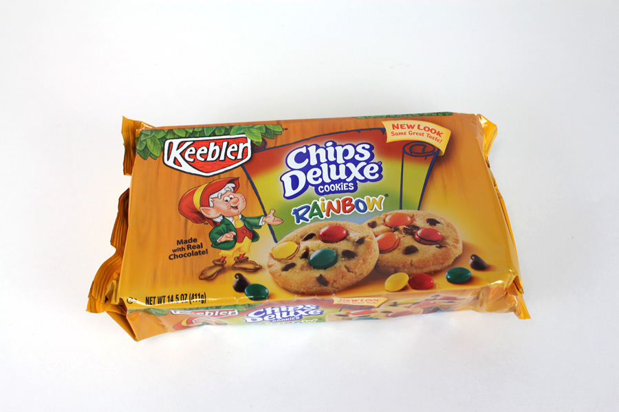
Keebler
Chips Deluxe: Rainbow
Appeals to the chillun and sweet tooths

The bright colors draw me in and the little Keebler elf, because I like sugar and I know Keebler makes some awesome sweets. The description of the quality of the cookies keeps me looking a little bit longer when I flip the package and look at the back.


Ethos
Jif
Creamy Peanut Butter
Appeals to choosy moms (and little kids)

I particularly get drawn in with the colors and especially the logo type. I like how the "j" and "f" are essentially the same shape just rotated. The logotype is the only thing that keeps me interested


Logos
Burt's Bees
Natural Skin Care for Men Deodorant
Appeals to smelly dudes who are avoiding the aluminum in other deodorant (that's what drew me in)

Yeah, knowing its deodorant without aluminum is a big appeal to me. The thought of it being created out of bee material is interesting too. I keep looking because of the ingredients used and the pattern on the front is nice to look at. Really the  content and make up of the deodorant do all the work for me here.

Monday, September 26, 2011

Final Billboard and Poster


Folly Poster Revised and Billboard


After some more feedback and considerations I revised my poster. This is the final result of this project. I chose to incorporate the swirling background again to keep the background from becoming too static and to provide a greater depth in the poster. A few tweaks were made concerning the typography and then the posters final elements were transferred to a hypothetical billboard. The end...

Sunday, September 25, 2011

Nnenna Freelon Poster Process (Final sketches to first digital)


These are my initial poster sketches for my Folly jazz poster. These sketches begin to explore the layout of the poster, the rendering of the poster, the typefaces used, and the way the information (date and time) is conveyed. The three concepts I used in sketching these were the idea of Freelon's voice flowing like water, her voice and music expressing love, and her show-woman-ship.


These iterations were the first digital compositions for the poster. Still rockin' the same concepts minus her vocals expressed using hearts reflecting the love in her music.


Dropped the idea of trying to visually express her vocals using a specific motif and moved forward with the idea of her stage presence. Instead of using a motif to express her vocals I have decided to allude to her vocals and music through color palette and composition in the poster.


Two further iterations of Nnenna's stage presence. The background I use came from my rendering tests exercise. It is construction paper slapped onto a white illustration board disc and spun on a record player to get the smooth blurred colors. 

Wednesday, September 21, 2011

Nnenna Freelon Folly Jazz Poster (FINAL)


This was the poster I put on display for the showing of our classes posters to the Folly musical directors. My concept employed two icons as allegories for two of the strongest characteristics for Nnenna. The spotlights act as an allegory for Nnenna's "showwomanship". Nnenna, being the center of attention in her performances demands a lot of attention through the vocals. The mic stands in as an allegory for Nnenna's vocals. Nnenna Freelon is a singer and is the attraction when she takes the stage. I use these two allegories to stress this nature of Nnenna's music. I want it to be obvious that she is a vocalist and that that is what the audience is going to be there for. 

The typefaces I chose represent Nnenna's elegance and pop jazz vocals. The typefaces have a modern aesthetic that not only references the pop music but also draws in a more modern and younger crowd.

The colors chosen I use to illustrate the mood of her music. The backing instrumentation that accompanies Nnenna is generally laid back smooth and very comforting and cool. The poster smoothly ranges from these cool colors to a burst of warm yellow. When listening to her music I picked up on the smooth cool music, but when she started singing I could sense this burst of warmth and love coming from her vocals. She is a very loving person and I see this frequently in her vocals so I chose to express this burst of a warm and loving vocal harmony.

Monday, September 5, 2011

Jazz Poster Rendering Tests

These were ten final sketches I curated based on the greatest successes from the matrix concepting session. I felt like these ten ideas illustrated her music in the best way. I have now narrowed down the concepts I would like to express in her music to: vocally based, voice is reminiscent of the elegance and flow of water, Nnenna possesses a great stage presence, and her music is largely about the loves in life. These sketches will soon be adapted to fit a poster composition that will include Nnenna Freelon's name, the time of the show and the date of the show as well as the imagery I choose to represent Nnenna's performance.


The following images are rending tests for Nnenna's poster. The purpose of these is to see what method of creating my desired aesthetic is the most appropriate for representing Nnenna Freelon and her music.


Digital drawing


Colored craft paper was glued to a record-sized illustration board. This board was then placed on a record player and spun to get a blurring of the colors.


Colored Craft paper underneath rippling water to distort the pattern of the paper.

Water color paints

Sharpie markers