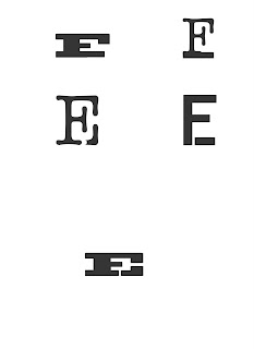
The element: iron. The Periodic Table of Elements symbol: Fe. The reason for the "f" and "e": the abbreviation is derived from the latin word for iron, ferrum. The idea behind the monogram: strong, sturdy, and the main idea that steel, which is made from iron, is one of the sturdiest and practical metal allows there is.
This set of iterations was based on iron and its natural state of existence. It's really never found alone in nature. It's almost always connected to some other element, in many cases oxygen through the process of oxidation (or rusting, in simpler terms).
This set was based on the allows of iron. Two substances come together to make a better stronger one. Carbon and iron are combined to make steel which is much stronger than either by themselves. These iterations were a little off though. The ones with the lowercase "e's" on top look a little floaty and don't have the sturdiness I wanted.
These iterations are also based on the two elements combined to make a better one. One difference from the above set though is that they work way better. The continuation of the leg of the "E" off of the serif of the "F" makes a good, sturdy, structured appearance, that was also combined by two things to make something better.
More iterations based on a few of the above.
This idea was eventually decided as the chosen direction. Refinement was needed though and a different font was eventually chosen.
THE FINAL MONOGRAM! After discussing the above iterations with Marty, I decided to change the typeface to Serifa. This is the result and that is what I'm talkin about. The one on the left had a space between the serif of the F and the leg of the E that was the same as the width of the serif on the lower arm of the F. The one on the right has had this changed. The openness of the one on the left was a little too big and slightly distracting. The image on the right is the final monogram.


No comments:
Post a Comment