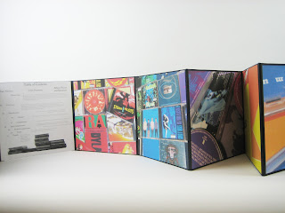
My color theory accordion book was done using album art work for the color harmonies. There are many colors present in the album artwork world, something I'm sure most people have noticed. Definitely something I've noticed, considering album artwork is my primary aim with what I plan to do as a designer. My main challenge in composing the photos was dealing with text and imagery in the artwork. For the most part I tried to find solid colors in the artwork, but I also wanted to maintain a variety in the albums the artwork was pulled from which made it a little harder to avoid all text and imagery. Also if the text and imagery was totally abandoned then the color fields become ambiguous and may not be seen as album art work at all. In fact, using just the solid color fields wouldn't be using album artwork. Album artwork is the text and imagery too. So what to do about the text and imagery to avoid distracting from the color harmonies? I tried to eliminate commonly known covers and imagery. Any imagery that would be recognizable (like Jimi Hendrix in the monochromatic purple composition) was covered up partially; just enough to remove the immediate recognition and distraction of the familiar, but still leave the color of the imagery present. As for the text, the best thing to do was to present it at angles and upside and sideways to make it harder to read. I also refrained from using whole words in any composition other than the warm, cool, and monochromatic pictures. Again looking at the purple composition, the text is arranged at angles, is for the most part on the two CDs (so the text curves) and is upside down.
The cropping was focused on close and angled compositions. The angles made the compositions dynamic, as opposed to boring simple layouts of album covers, and helped bring the feel of album artwork into the pictures. When the entire accordion book is unfolded the compositions look like a pile of CDs and cases laying on the table. The angles also allow a sense of dimensionality whereas (and it can be seen in the cool and warm compositions) the straight up and down layouts are more two dimensional.
Possibly my favorite part of the book is the Table of Contents. I have a decent mental repository of album names and their artists, and in many cases I know albums down to the songs on it and in some cases the sequence of the songs. Musical information (not so much the actual making of music, and musical knowledge) interests me a lot. I actually considered being a music historian for awhile and it's still a consideration even now. So to get back to my book, I included the names of the albums and their artists that were used in each composition. It almost makes each composition like an I-Spy book. This also allows viewers to connect to the compositions on a more personal level through the familiarization of musical artists and albums. So, I took the familiarization out of the compositions to avoid distraction, and I put it in the Table of Contents to create an interest. Now does it create a distraction because the compositions come after the Table of Contents? I don't think so, but that's a little tough to determine.


No comments:
Post a Comment