Sunday, November 14, 2010

Thumbnails to Motifs

Mackenzie and I chose two haikus that we thought had the best visual picture portrayed by the lines of the poem. We originally had around fifteen selected from various sources and decided on one of the haikus Mackenzie found and one that I had found. The first, and rejected haiku, is:


Empty trees, bare bone
Dancing skeletons caper
Hear the howling wind.

These are the ten thumbnails produced for each line.


The second haiku, and the one that we decided to continue the project with, is:

Windy winter rain
My silly big umbrella
Tries walking backward

These are the ten thumbnails for each line, and also the first round of iterations for the haiku sketches to be used in our final project.


Second round of iterations. 

 Final iterations of haiku line sketches.


 This is where the objects we found relating to the haiku came into play. We had accumulated marks produced by the objects. These marks were unique to the objects and unique to the way the object was used to make the mark. These objects were covered in ink and then dropped, splattered, pulled, twisted, and pressed on paper to make a mark. We then looked at all of these marks to find the forms we needed to recreate our haiku sketches using just the marks. In some cases, these motifs are basically direct translations from the sketches and in other cases the most similar marks were applied to replicate the sketches. In these instances, a difference is evident in form, but the same concept is still communicated.

Windy winter rain


My silly big umbrella


Tries walking backward


Reach Out and Read first sketches


My main concern behind these poster designs was to keep the text limited. In my own opinion, the parents that this program primarily needs to reach probably don't like reading and therefore don't read to their kids. They don't understand the importance because they never benefited from it. Therefore, they wouldn't stop to take the time reading statistics and research and all these explanations behind the importance of the program. So I tried to use rhymes and short phrases in my posters to keep it simple and appealing to those that don't appreciate statistics and text. I hope to catch the attention of people with the posters imagery (analog letters or imagery) and then hopefully from there they would read the bottom of the poster for the information that wouldn't have attracted them in the first place.

I wanted the phrases and words I used to be affirmative but somewhat vague. Vague to provoke the viewer to think deeper about the importance behind reading to children and just reading in general. 

Friday, November 12, 2010

Periodically Speaking Yo (Final Deliverable)


 Here's some digital versions of the final deliverables for the Periodically Speaking project in Typography 1. I was particularly interested in this project. The use of typography in creating the monogram and both layouts was very interesting. I often get lost in details with my work, so working with the details in these pieces (the leading, rags, orphans & widows, alignments, and grids) was an enjoyable experience. I am also very fond of chemistry and science, researching (chemistry and physics research especially), and the histories and stories behind many things. It was nice to design for something not human or human related. There are set characteristics in elements and we set out to exemplify them in the designs of the monogram, two-page spread, and web layout and these characteristics don't change like human moods and preferences do.

Friday, November 5, 2010

Leo Lionni and The Urge to Make Things

Leo Lionni wrote and illustrated children's books. He was born in Holland in 1910. He moved to America in 1939 and worked as an art director for a few advertising businesses, including Fortune magazine. In 1962, he moved to Italy and began his career as an author of children's books. Before moving to the U.S. Lionni painted in Italy, strongly concentrating on Futurism and avant-garde aesthetics. When working in America, he was commissioned for some work by Saul Steinberg, Andy Warhol, Alexander Calder, and Willem de Kooning. He also won a Gold Medal in 1984 from the American Institute of Graphic Arts.

Creating with no end in mind is certainly my favorite aspect in art. It allows for the most creativity and it also relieves the pressure of deadlines and having to survive on what you create. When the issue of surviving (financially) comes into ones life, a constant worry is created over maintaining an income. This would tend to cause artist's to "sell out" and many do. This isn't a bad thing by any means really. I just feel like the need for an income really distracts from the idea of art. Art is meant for creation and reflection. It should provoke thought and curiosity. It should inspire viewers. Many artists do this, even the ones that are commissioned to do work and must work within certain perimeters set by the buyer of the work. Basically, I'm saying that the concern for money limits art. Art should just be creation and the enjoyment felt just by creating. Experimenting allows the most learning. Artists don't really learn if they are commissioned to do the same thing over and over again.

In this project, in this step of said project, we experimented. We created. We played. And it was all without any definitive idea in mind. We just set out to learn. Learn how our objects could be used to make marks. Learn what kind of marks can be made from these objects and processes. It was like being a child. No worries, just play. The process of creating these marks was an artistic experience. The task assigned to learn, and in this learning there was an enjoyment. I learned for the sake of educating myself artistically, not for producing one, final, restricted, and expected idea.

Thursday, November 4, 2010

Taken by Storm

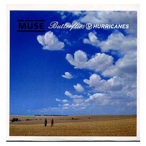
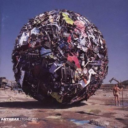
So a while ago, back in the days of the dots, I was lookin for books at Half Price Books. This was of course a hunt for imagery for the dot books. Anyway, during one of my trips into the store I stumbled upon this book titled Taken by Storm. The cover of the book is what caught my eye. It was the album cover of Audioslave's self-titled debut album. I am not a fan of Audioslave. I am a fan of the pieces of Audioslave (Tom Morello, Brad Wilk, Tim Commerford, and Chris Cornell), but that's beside the point. I noticed an album cover and immediately knew it was an album artwork book. Before I knew it, I had looked through the whole book and had spent half an hour doing so. Of course, I was brief with each page. I planned on buying the book anyway so I skimmed through, snatched it up and now have it to refer to for inspiration. I've always been interested in album artwork and came to the decision of wanting to design album artwork a few years ago. So it was natural for me to pick this book up. I did not expect the epicness that this book possessed. I knew it would be good but I didn't know that this book was just one artist's work, and I never would have guessed that this guy has done some of the best and well known album covers from the past 45 years. The designer is Storm Thorgerson, and his job is to create truly epic moments and use them as album covers. Basically. Just witness a few of my favorites and see what I mean. Really. Epic.
 Butterflies and Hurricanes single-Muse
 Try Anything Once-Alan Parson's Project
 On Air-Alan Parson's Project
 Secret Society-Europe
 Deloused In the Comatorium (alt. cover)-The Mars Volta
 Houses of the Holy-Led Zeppelin
 The Widow single-The Mars Volta
 Tree of Half Life t-shirt design-Pink Floyd
 Bottom Half-Umphrey's McGee
 Wish You Were Here-Pink Floyd
Stomp 442-Anthrax

Refined Webpage Design

I chose this layout from my critique with Marty. She pointed out that the image and the text have a "push-pull" effect on the layout. I maintained this effect and tried to rearrange the rest of the page to compliment it.


These next five images are basically the process in my rearrangement of the layout. The last image is the final outcome and my final refined layout.