Dollar Bill Layout
Labels for the various insignia, codes, and other such legal obligations that are printed on American Currency.
http://www.ischool.utexas.edu/~jpwms/mixednumbers/money.html
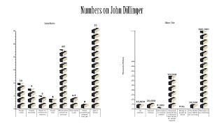
One of two John Dillinger graphs. This one charts some interesting numerical values he encountered in his bank robbing days. It mostly shows some fun facts for the bank robber like how many times he was shot at his ambush, how many police officers and FBI agents there were to arrest him at the ambush, how many people he killed during his escapade, etc.
http://www.billlucey.com/2009/06/john-dillinger-fast-facts.html
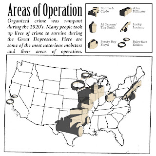
This is a map showing the various urban locations of the Mafia in the United States.
http://www.americanmafia.com/26_Family_Cities.html
Another John Dillinger graph. This one shows some particular cash values that were attributed to him at different times in his life like the reward for his capture/info on his whereabouts, his total accumulation of money from bank robberies, and the amount of money in his pocket at his death.
http://www.billlucey.com/2009/06/john-dillinger-fast-facts.html
A timeline of Al Capone's life. It charts his life from the moving of his parents to the U.S. to his death.
http://timelines.com/topics/al-capone
Timeline of the Prohibition on alcohol in the U.S.
http://americanhistory.about.com/od/prohibitionera/a/prohibition.htm
Timeline of Bonnie and Clyde's killing spree.
My Life with Bonnie & Clyde by Blanche Barrow
A map of where Bonnie and Clyde had killed a person or people in there attempts to stay away from the authorities.
http://en.wikipedia.org/wiki/Bonnie_and_Clyde#The_spree
A graph showing the rise in crime rates & federal prison expenditure and occupation.
http://www.albany.edu/~wm731882/organized_crime1_final.html
These infograph sketches were then transformed into the following six. These six graphs were a push in finalizing the content of the graphs. We also decided at this point which infographics were worth keeping and which weren't. These all also begin to explore the type that will be used for the infographics.
A differentiation between the civilian and police officer killings was made and implemented in this iteration.
The graph was broken into two graphs to showcase one for crime rates and the other for penal institution expenditure and inmate population.
The two John Dillinger graphs were combined to draw a connection between the two. The random numbers happened because of his time robbing banks and the cash values exist because of the same reason.
Some more minor cities dropped from the map to clear up space.
The level of drank in each jug references the amount of illegally distilled liquor that was being purchased throughout the course of the Prohibition/Temperance movement. There is no actual quantitative value attributed to the amount, but the increase is only there to imply the increase.
These six then became the following six. These six begin to explore style choices, and at this time had been narrowed down to four infographics. Stylistically, I wanted to reference the 3D elements and the spotlight-like harsh contrast of my icons.


No comments:
Post a Comment